

Entry posted by Nathan Strum
2,283 views
Warring Worms: The Worm (Re)turns (2005)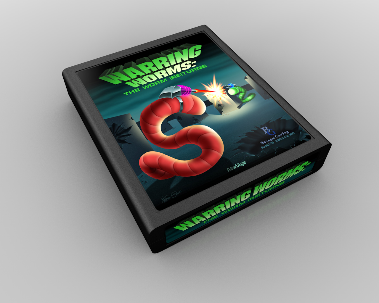
Warring Worms: The Worm (Re)turns was my first non-contest label. I was asked by Billy Eno to create the label for his update to his earlier game Warring Worms. WW:TWR is sort of like Surround but the players have weapons and the game variations number into the thousands.
I don't recall if it was Billy or myself who thought of the concept, but basically it was a riff on a line from Austin Powers about sharks with "frickin' laser beams attached to their heads". It practically draws itself! (Figuratively, not literally. I had to draw it of course, and several times at that.) I thought 50's-era sci-fi laser cannons would fit the theme really well, with big, colored plexiglass rings and lots of chrome.
The initial sketches and roughs were done using Painter. I started out painting first, just laying down color quickly to get the idea down. Afterwards I sketched notes to myself in the same document. I wanted the foreground worm to be more aggressive, and the background one to be hiding: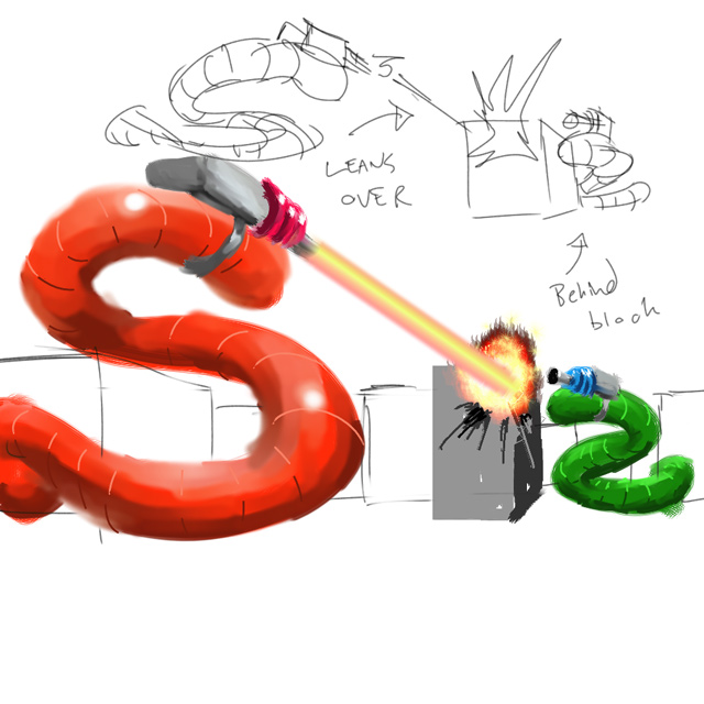
That led to a more revised sketch: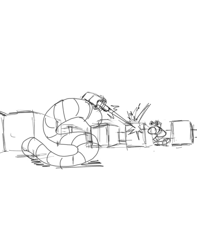
And a color rough: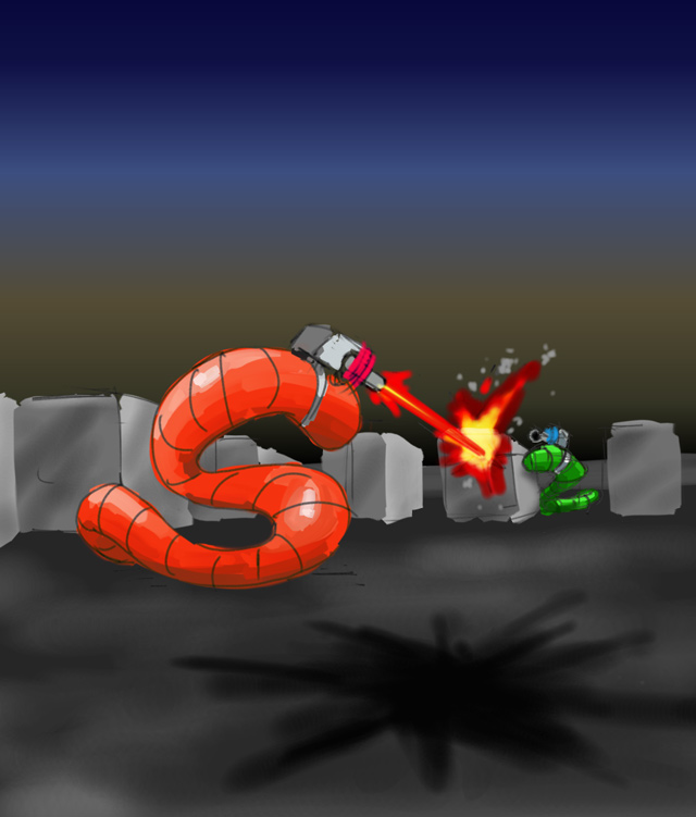
The environment is a bit bland with a gray ground and blue sky (my penchant for coloring things literally). I added a haze of smoke (or L.A. smog) as if the fighting had polluted the environment, but that only muddied things up.
The big problem so far though, was everything was too horizontal. Labels are vertical, so I addressed that in the next sketch: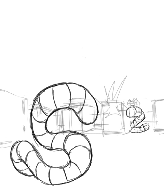
With the layout and basic drawing in place, I moved from Painter into Photoshop for the rest of the project.
The blocks were created in FreeHand and imported. The blue lines show where the artwork would eventually be cropped. It's important to take that into account when creating an illustration. Printers aren't precise enough to print an image right up to the edge of a label - you have to allow a margin of error (bleed), so some of the artwork has to be designed so that it can be cropped off without being missed: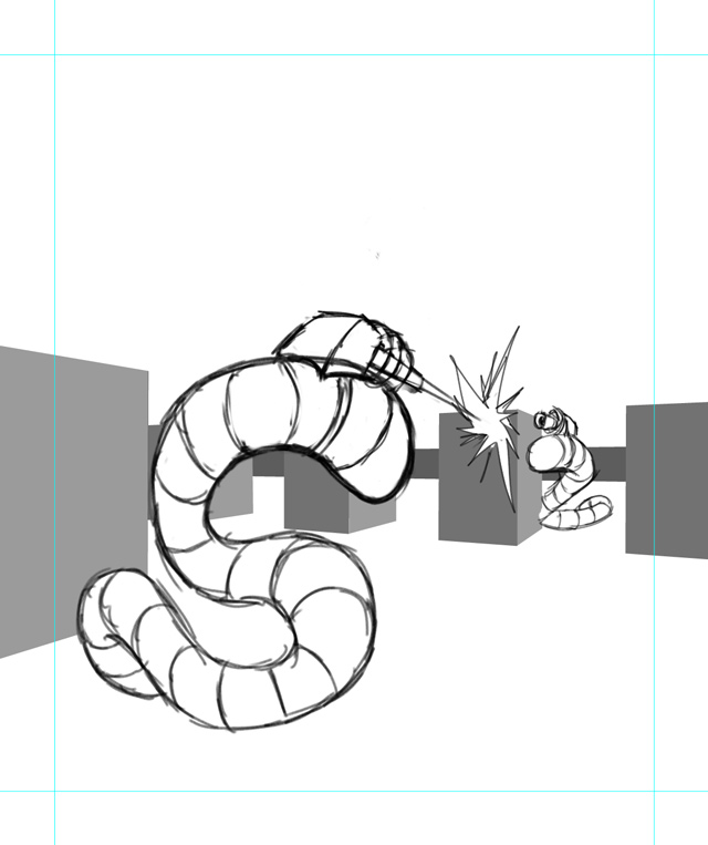
I started laying in color - trying to liven things up a bit while still retaining a moody feel to it, and working on the logo (the fonts are Machine for "Warring" and Eurostile Bold Extended 2 for "Worms"):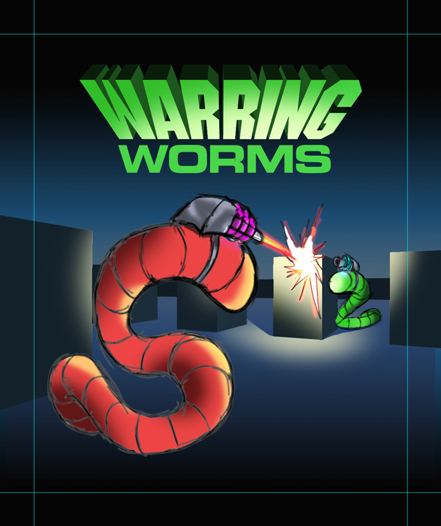
At this point, the game was still to be called just Warring Worms. I thought that since he'd made so many improvements to it, it should have an updated name, and I suggested Warring Worms: The Worm (Re)turns, and he liked it, so it stuck. The logo and type were created in FreeHand.
With the logo's color being so dominant, I pushed the rest of the palette towards green. This made the label more vivid, and helped the foreground worm to stand out even more. This sketch served as the foundation for the final artwork, all painted in Photoshop: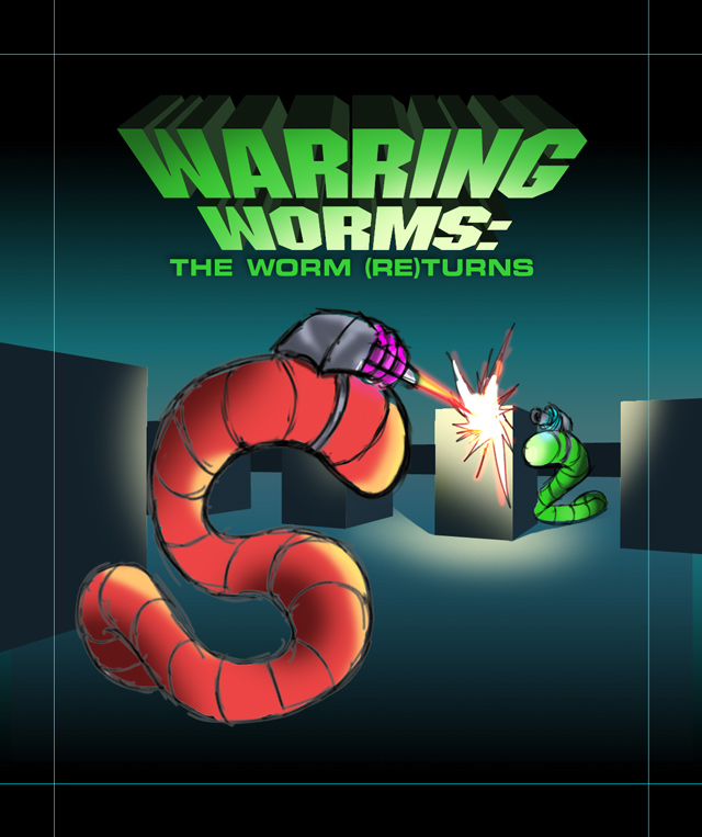
I still like the label - the translucency of the foreground worm is particularly nice, and this was the first label I'd done with no visible lines which helped push it from being a cartoon, to more of an illustration. That said, there are some changes I'd make now. I recall Dave Dries pointing out to me at the time that it needed more detail - texture, debris, meteors falling from the sky, that sort of thing. At the time (and still, for that matter) I had problems pushing my artwork past my comfort zone. I get something that looks good to me, and don't want to risk ruining it somehow (a ridiculous concept in digital art, as long as you save incremental versions as you go). So I would definitely push the detail more now, especially in making the arena look more war-torn. I'd probably also change the neon colors in the worms' laser cannons, to better fit in with the rest of the color scheme.
As an aside - this was the first label I put my name on. I think because the previous ones were for contests, I didn't quite feel right about putting my name on them. Not sure why. Maybe because I was asked to do this one, I felt it was okay to attach my name to it. From this point on, I would put my name on most of the labels I created. But not all of them. But yet again… that's another story. ![]()
(Yes, I realize I'm using "that's another story" a lot in these entries. I'm trying to come up with another cliché besides "Anyway…" to overuse in my blog.)
0 Comments
Recommended Comments
There are no comments to display.