

Entry posted by Nathan Strum
2,021 views
2005 MiniGame MultiCart (2005)
The 2005 MiniGame MultiCart - my second for-hire label - is a collection of mini-games. When I say "for-hire", I should probably point out that I get paid in store credit or homebrews. I don't ask for money or royalties. From my standpoint, this is still a hobby. If it starts crossing the line into work, then I need to step back from it. This has happened a few times, and as a result I'm more selective about the projects I take on now.
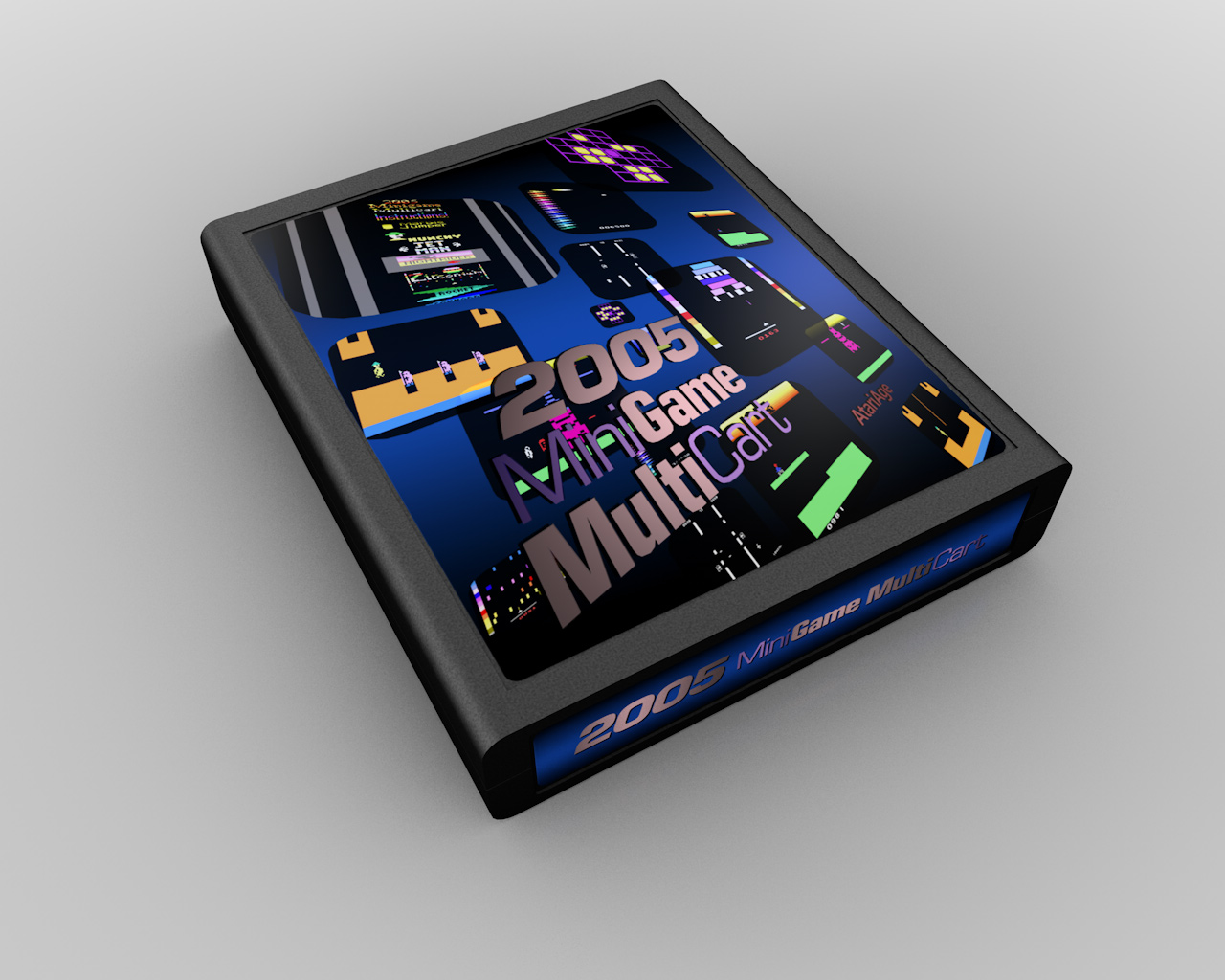
By a wide margin, this is my least-favorite label that I've designed. It seems to me there was a big hurry to get this done (and I was laying-out the manual for the cartridge too - all seven games - further constraining my time), so I couldn't really spend the time making the sort of illustration for it I would have liked. It would have been great to illustrate an Atari-like collage of elements from all of the different games, but instead, I threw some screenshots into a 3D program (Cararra) and that was that. As for the logo, the idea was to use a thinner font (Helvetica Neue Light) to visually reinforce "Mini" and a heavier font (Eurostile Bold Condensed) to emphasize "Multi" ("2005" uses Eurostile Bold Oblique, to visually balance the rest). While not a bad idea, the way it turned out it just sort of reads as "Game Multi" at a glance. I could spend a long time listing everything I dislike about it, but the big three are: the logo (effectively unreadable), the layout of the games (no rhyme nor reason to it) and the color choices (legibility and contrast are terrible). Plus, it's just unimaginative and uninspired. It's really too bad, since the collection of games merits better than this.
It's ironic that my least-favorite label ended up on a cart that managed to stay pretty consistently in the AtariAge store's top ten since its release. So it's in the hands of quite a few people, despite the fact that I would prefer that nobody ever it in the first place. ![]() I wonder what that says about how label artwork affects purchasing decisions?
I wonder what that says about how label artwork affects purchasing decisions?
Digging through my old files I found only a couple of relics related to this label, reinforcing how little time was spent developing it. The first - a tunnel layout - was also done in Carrara and was a riff on a movie and desktop I made for The Games That Time Forgot. The TGTTF files were themselves riffs on the beginning of Tron and a scene from Kim Possible: A Sitch in Time. Riffs, or shameless ripoffs. One or the other. ![]()
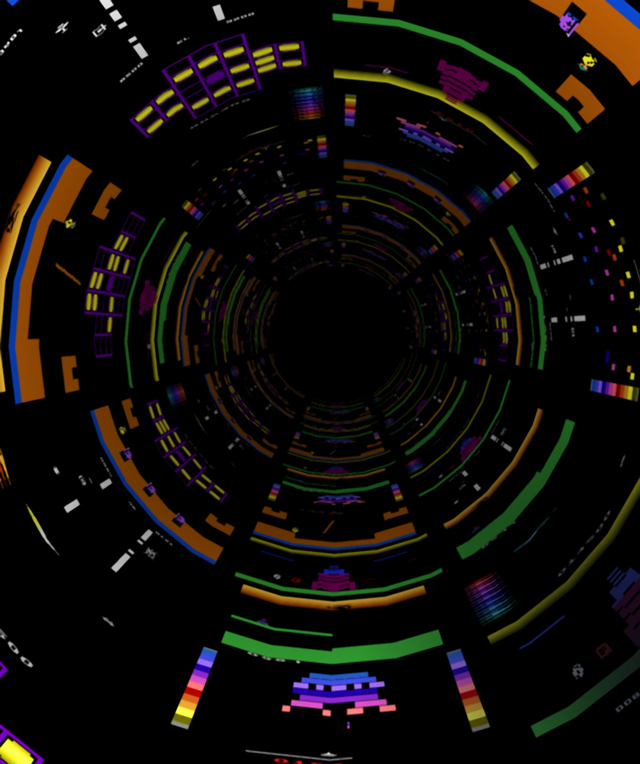
I think the tunnel would have been a better label, if I'd pursued it a bit more. A couple of things needed fixing. First, the screens are all lined up. Instead, they should be offset from each other (a running bond pattern). Second, because there's so much black in the screenshots, there's little to define the boundaries of each screen. So wrapping them onto monitors and applying some lighting to bring out highlights and shadows would have helped. But I don't think I had the time (or possibly the necessary software) to do it.
The other file was basically the final label, but against a black background. I like this a lot better than the blue gradient, because the text is easier to read, the imagery is more vivid, and...
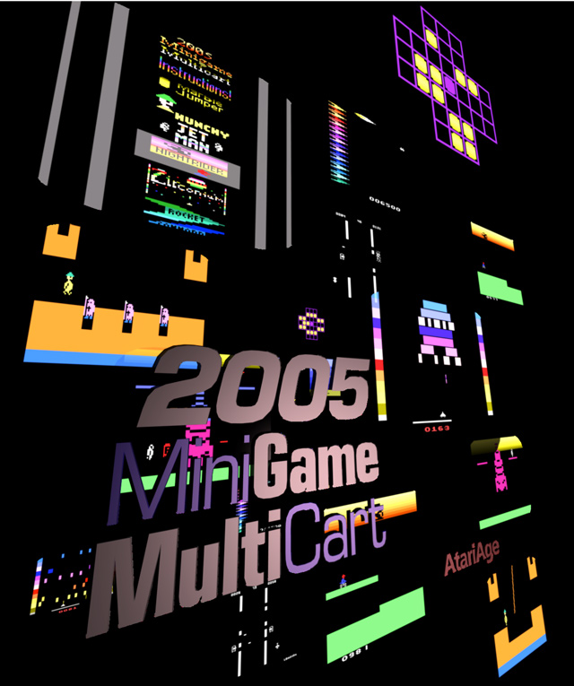
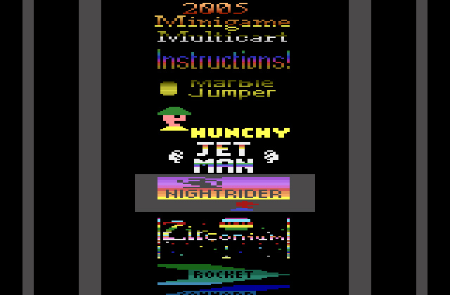
...it also looks reminiscent of the in-game menu:
Oh well… maybe if someone decides to do a 2015 MiniGame MultiCart, I'll get another shot at it. ![]()
4 Comments
Recommended Comments