

Living in Harmony
Entry posted by Nathan Strum
6,018 views
Awhile ago, I went over the process for coming up with the Harmony cart logo, and the pre-production label. I assumed at the time that there wouldn't be much of a change from that label to the final.
Hoo... boy! ![]()
Fred (batari) was interested in having a new label for the final cart (now available for purchase), although he wanted to keep the same sort of color scheme (green and white) as the previous one. The green and white, incidentally, comes from the color of the circuit board and the silkscreened logo on it. He also wanted to incorporate a yin yang symbol into it, since that's what the Harmony cart uses for a "wait" icon on screen. Plus, it ties into the whole Harmony theme nicely as well.
He'd dug around on the internet, and found this:

Initially, he'd suggested wrapping the circuit board and maybe some code onto the surface, mimicking this graphic fairly closely. But I didn't really want to just re-do something someone else had done. But I liked the idea of a glass sphere for a yin yang, and somehow incorporating the circuit board into it, since that was used on the pre-production label.
What I ended up doing, was placing the circuit board inside of a glass yin yang, in 3D. By changing the index of refraction of the glass, I could distort the image of the circuit board to effectively wrap it onto the inside surface.
First, I had to build the circuit board. This was streamlined a great deal by the fact that I could open up the same file used to make the real circuit board in Illustrator, and exporting that into my 3D program (Carrara). Of course, it wasn't quite that simple, since I first had to break everything into usable pieces - the board, traces, holes, silkscreen, etc., then reassemble them in Carrara as a model:
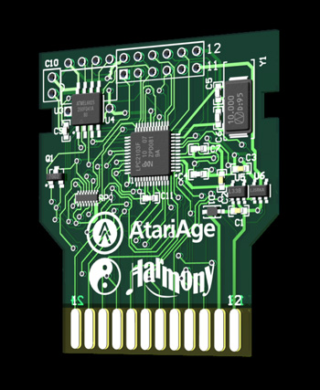
I made the board translucent, so the traces on the back side would be partially visible, and so the light would shine through it.
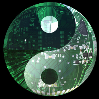
Next, I had to build the glass yin yang. This was actually pretty easy - it's just a glass sphere cut in half with a spline, and a couple of holes punched through it. Using boolean operations, I was able to end up with all of the parts I needed.

(I tried just using a simple glass sphere, and colorizing the yin yang pattern in Photoshop, but that lacked all of the interesting internal reflections and distortions that the extra geometry caused.)
I ended up making two rendering passes with different lights turned on. I wanted the color intensity of the brighter one, but needed to blend away some of the over-exposed areas by combining it with the darker one.
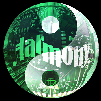
For the logo, initially I was going to use the silkscreened logo on the board itself, but that would have been too small. So I removed that, and placed a much larger logo in the sphere. The problem was that the geometry of the yin yang caused unwanted distortions in the logo. So I had to cheat.
I rendered out just the Harmony logo within solid green and white glass spheres, and used alpha channels to mask them:
![]()
![]()
This ensured that the overall refraction, color and lighting would match the yin yang/circuit board rendering.
Then I combined them together in Photoshop:
![]()
Then, the whole thing was composited in Photoshop - the different yin yang renders, and the logos - into the final image:
Each rendering pass for the yin yang took about two hours. (The logos were much quicker.) That doesn't count all of the test renders done to get the lighting, color, refraction, lens distortion and camera position dialed in.
I'd guess that on a newer eight-core Mac, that would be closer to 15 minutes per render. ![]()
This is the final label, as seen on the production version of the Harmony cart:
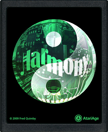
I completely neglected to put my name anywhere in there. In hindsight, I should have hidden it in the text printed on one of the chips, or silkscreened my initials onto the circuit board.
I also ended up doing an AtariAge logo yin yang for the back cover of the manual:

This gives you a better look at just the sphere, without the circuit board in it. It uses all of the same tricks - multiple render passes, doing the logo separately, and compositing everything in Photoshop. But since I'd already finished the Harmony image by then, this one went much more quickly.
Also in the manual, I had to create a few illustrations showing how to use the Harmony cart. I could have tried drawing them in Illustrator freehand, but there's a better way - I just set up what I wanted to have in each illustration, and took a photo of it with my iPhone:
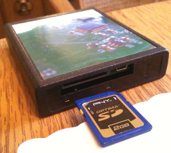
Then I simply drew over it in Illustrator, cleaning it up and straightening out lines as needed:
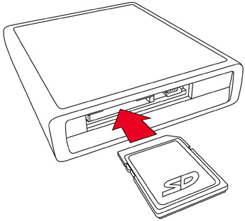
It ended up as a nice, clean illustration that clearly gets the point across. Sometimes simpler is better. (The SD logo is trademarked, so Fred asked me to come up with a non-infringing look-alike.)
The latest thing I've done for the Harmony project was create a Melody logo:
![]()
I used the same process as for the Harmony logo.
Technically, the Harmony board shown above is a Melody board. The same main circuit board is used for both the Melody and Harmony - but the Melody is a single-cart version for use in homebrews, while the Harmony adds multicart functionality. I just never got around to modeling the additional circuit board that contains the Harmony's SD card slot and USB port. It's just as well though - this has a more symmetrical look than a full Harmony board does.
The Melody logo won't actually be used on Melody boards - it's too expensive to do separate runs just for the sake of a logo, so everything has the Harmony logo on it. The Melody logo is basically just there for use in the AtariAge store.
2 Comments
Recommended Comments