

Entry posted by Nathan Strum
1,946 views
This is the first entry in a series recounting label artwork I've created at AtariAge. In addition to labels that have been published, I'll also be posting designs I entered into contests - including the losers.
This entry is from the latter category. I have a lot of these. Despite winning several contests, I've created far more losers than winners. ![]()
The pictures showing the final artwork are 3D renderings (read this to find out why), which can be clicked on for larger views. Entries will be posted in chronological order… so with that, let's start at the beginning.
Climber 5 (2003)
When the contest for Climber 5 came along, I'd been a member of AtariAge for about six months, so I was still pretty new to the whole idea of the homebrew scene. There had only been a few label contests before this one, so there weren't many winners to help determine what direction might to appeal to programmers (hint: there is no single direction - everyone likes different things). But what the previous contests did show, was that there was a lot of talented folks at AtariAge.
For myself, I had all-but stopped drawing several years prior to this. I had burned out on it, since I'd been either studying art in college (three of 'em) or trying to earn a living at it for the better part of 15 years. I had also stopped trying to find work as an artist after my last freelance gig ran its course in '98, and I'd settled into a technical staff job at a college. With only a few exceptions, I rarely picked up a pencil. Something I'd once loved doing (and had been doing since I was old enough to hold a crayon) had become a chore.
Somewhere in there, I started up MacMAME.net - a website devoted to the now-defunct Mac port of the MAME emulator. That and some other videogame-related artwork were about all I was doing at the time. Most of it was more graphic design than drawing, but classic videogames had reignited a creative spark of sorts.
As MacMAME wound down (and died off) I was drawn more to the Atari 2600 and wound up at AtariAge. When the Climber 5 contest hit, I decided to give it a shot.
Since I'd been working some in 3D programs at the time (and because I didn't have much confidence in my drawing skills at that point), I decided to make the backgrounds using a 3D program - Infini-D. It was a bit of a crutch, but worked okay. I didn't even sketch out any rough ideas - I just drew the running ballplayer (in Photoshop) with no background.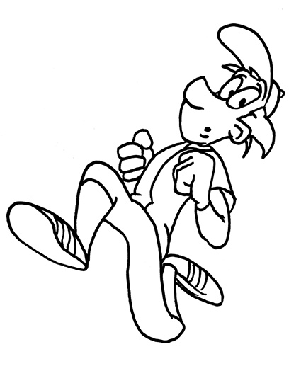
In hindsight, it's a pretty terrible drawing. The line quality is a mess, his downward leg is way too long, his face is lopsided, etc. But hey… at least I was drawing again.
From there, I imported him as a flat object into Infini-D, built the girders and ladders, and moved the camera around until I had a composition I liked.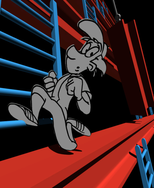
From there, I rendered just the background, brought it into Photoshop, dropped the player drawing over it and painted him. Then I retouched some elements (such as the swinging girder) to make them read better.
Since I'd decided to work in 3D, I decided to make the baseball for the end label a 3D object as well. Looking back at some of the test renders, I can now recall having all sorts of problems getting the stitching to map onto the ball correctly (as evidenced below):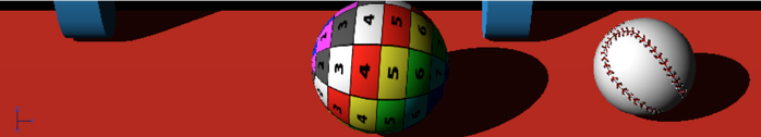
Eventually I sorted it out. It even has a bump map so the stitches stand above the surface and the seams carve into it. This is what's known as "overkill". ![]()
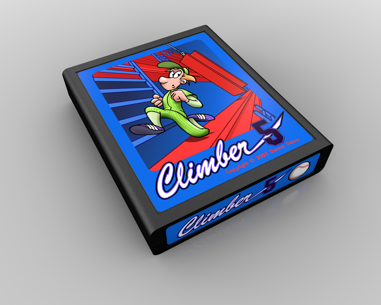
The logo was created in FreeHand using Brush Script for "Climber" and Machine for "5". I wanted to mimic the look of the fonts used on baseball uniforms, and I think that was successful. It's still a good looking logo, although the "5" needs to stand out more. A thicker outline would have done the trick.
The player was shaded to blend in better with the 3D. I didn't go for a photo-realistic rendering, but even as simple as it was, the 3D just didn't fit the cartoony theme: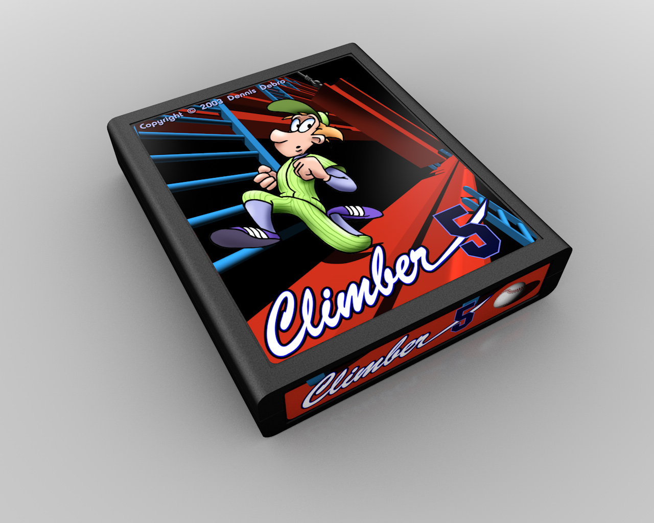
With that, I made a variant on the label, where I ditched the 3D shading in favor of flat line art. I think this turned out much better. I also made an attempt at coming up with a distinctive style for the label: the artwork is "framed" by a solid color that fades into the background gradient. I still like the look of this from a design standpoint, so you may yet see it used in a label someday (certainly, you'll see it a few more times in these blog entries ![]() ).
).
Not being satisfied with that particular illustration, I came up with a second illustration for the contest. This was created using the same steps as above. This was a much more dynamic cartoon, and better fit with the action of the game. It showed the player's goal (the baseball), showed more jeopardy (the height, ladders and girder), and had better action. Plus, it included the player's number on his back as well.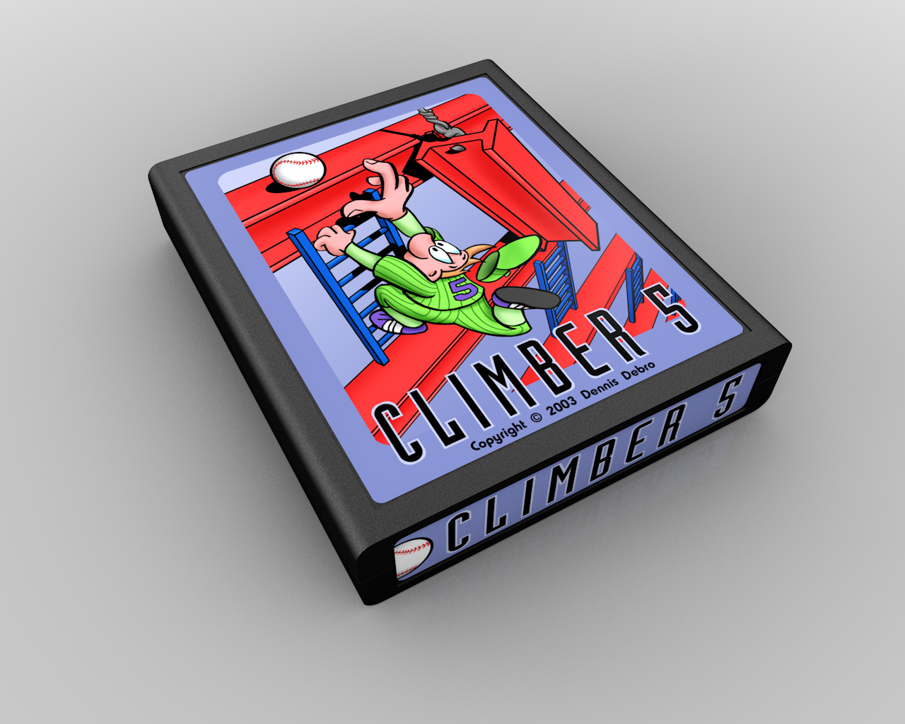
The illustration looks a bit cluttered to me now. To improve it, I'd put fewer rows of girders in it, and make them farther apart with taller ladders. That would give some more space beneath the player.
This label uses the same design concept as the second one, but a different font for the logo (Industria). I probably can't justify its use, other than I've always thought it was a cool looking font. But let's pretend I used it to imply height and mimic the ladders in the game. ![]()
The mauve color doesn't really work very well for me now. Had I to do it over, I'd use the darker blue and the type treatment from the second label instead.
Of course, if I had to really do it over again, I would have submitted it as an Atari silver label design. But that's a story for another entry.
In the end, I didn't win the contest, but this contest did something that nothing else had managed to do at that time - it got me drawing again. For the fun of it.
5 Comments
Recommended Comments