

Making Labels - Part 4

Entry posted by Guest
1,532 views
Part 4 - Shading
I'm going to split shading into a couple of categories: Shading and Highlighting. They're actually both part of the rendering process, but the way I approach them in Photoshop is as separate steps.
The reason for this is flexibility. This goes back to the whole thing about splitting the Photoshop document up into layers. I can experiment a lot more by keeping them on different layers, and adjust them as needed.
First though, I'm going to sidetrack a little bit.
Transparency
Each layer in Photoshop can be set to composite with other layers a number of different ways. We've already used Multiply to make the line art appear transparent. Now, we're going to use it again for a different effect.
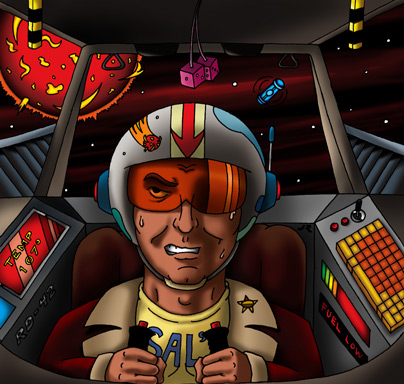
If you look at the flat-colored artwork, you'll note that the pilot's goggles are orange:

Line art by Jess Ragan
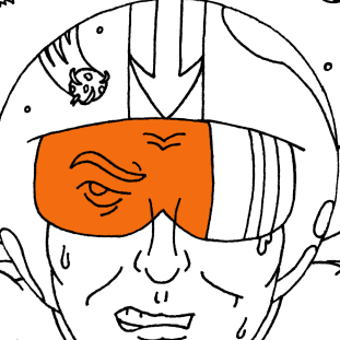
But this wasn't done on the Color layer. There's a part of his goggles that I want to be transparent, and it's actually on another layer. If I turn off that layer, the artwork looks like this:
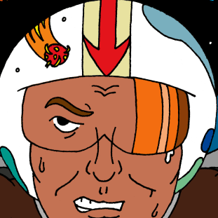
So why do this? Well, the part of his goggles on the right is drawn just as a reflection - so I knew I wouldn't see his face through it. But on the rest of it, I can see his eye and nose. Since I'm going to be shading this drawing, it will be easier to get all of the shading consistent if I do his face all at the same time, using the same colors. In order to do that, I had a couple of options. One is to shade his entire face first, then select the goggles area and tint it orange using the Hue/Saturation controls. The problem with that, is I couldn't go back and easily rework the shading on his face - because part of it would now be a different color.
To get around this, I made a new layer, with only the goggles' color on it. I selected the area I wanted using the Magic Wand, created a new layer called Goggles, and then used my Expand and Fill action.
Then, I set the layer to Multiply, and ended up with transparent orange goggles. Now I can turn off that layer when I need to work on his face, and also adjust the color and opacity of the goggles if I need to.
After a little touch-up, here's what the Goggles layer looks like just with the line art:
Grouping Layers
When you get ready to start shading, you should create a new layer called "Shading". This layer should be below your line art, and above your Color layer.
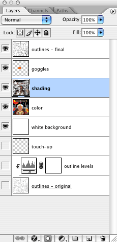
This also shows the Goggles layer, which is above the Shading and Color layers, so the orange color appears over both of those layers.
In order to shade an area of the drawing, you need to make a selection mask so you don't shade the surrounding areas. These are the same steps shown in the last tutorial, with one change:
- Turn off the Color layer.
- Select the area (or areas) you want to shade with the Magic Wand.
- Run the Expand Selection action.
- Turn the Color layer back on.
- Be sure the Active layer is the Shading layer. This is the layer you're working on now.
The reason for turning the color layer off, as mentioned already, is to get a consistent selection each time. However, once you begin to add shading, if you need to go back into an area to rework it, you'll also need to shut off the Shading layer before using the Magic Wand.
To avoid having to click off and on several layers all the time, you can group multiple layers together. This allows you to shut off a bunch of layers all with one click.
To do this, click on the little folder icon at the bottom of the Layers palette. This will create a new folder above your active layer called Group 1. Just click and drag the layers you want to add to the group onto Group 1, and they'll appear below it, but offset a little.
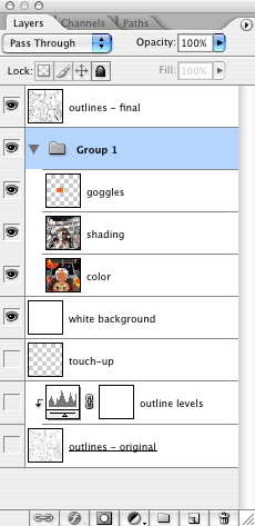
Now if you click the visibility icon (the eye) next to Group 1, it will turn off all of the layers in that group at one time. You can still turn on or off the individual layers, too. As you add more layers, you can also add them to the group, and change the order of the layers within the group. If the group itself isn't at the right layer, just grab it and move it up or down the list.
Where this gets really convenient is when your illustration is made up of multiple layered elements. This is how I usually work. I'll have the characters, backgrounds, and other elements each on their own layers and groups. This allows me to work on individual pieces of the illustration and manipulate them as needed. For example, for my Go Fish! entries, each fish was a completely separate group of layers, and I could move, resize and re-color each one until the overall composition looked the way I wanted it to.
Shading
Okay, now the fun stuff. Once you've got an area selected, it's time to start painting!
Here's a good, basic rule for shading: Pick a light source, and stick with it.
Shading results from light hitting an object. The shading happens on the part of the object away from the light source, or is cast onto another object as a shadow. So if your light source is on the left, the shading will be on the right. If it's behind an object, the shading will be on the side facing you. If the light is behind you (the viewer) the shading will be on the far side of the object.
Keeping this in mind will help you figure out where to put the shading in your drawing.
The more contrast there is between the light and dark areas of an object, the more intense your light source appears to be. If the shading is fairly even across the surface, then your light source will appear to be softer, with more ambient light present. Ambient light is a general light that comes from all directions, usually because it's reflected off of other surfaces from multiple sources (such as a room with several fluorescent fixtures).
Shading is defined by the shape and surface of an object. As your shading an object, follow the light from it's source across the surface. Try to figure out what areas will be in light, and what will be in shadow. Is there a hard edge in the way of the light? Is the object smooth? Is there something between that object and the light source? Will there be a shadow cast across that object as a result? Will the object cast a shadow somewhere else?
There's also going to be some light on the shaded side of the object, too. This is called reflected light.
Reflected light happens because almost everything reflects some light. And when this light is reflected back onto an object, you'll see it.
On this sphere, the light is coming from behind and to the left of you (the viewer). So most of the shading is on the right. But there is also a small amount of reflected light on the bottom right of the sphere.
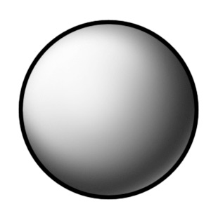
Reflected light is an important thing to remember. Even if it's very subtle, it will make the object feel like it has more depth to it. If the shading just goes all the way to the edge at full strength, it tends to flatten things out. Sometimes you may want to add more reflected light than should really be there, just to help define an object that would otherwise be completely in shadow.
The sphere shown above has a gradual transition from light to dark. This tends to make the surface look smooth, but with a very dull finish on it.
By contrast, if I make the edge of the shading sharper, and put a strong highlight on the object, I get a surface that looks very hard and smooth:
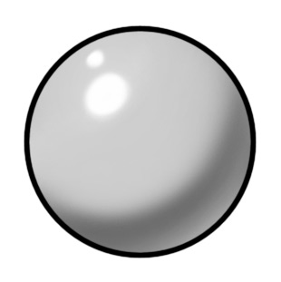
This is because you're seeing the light sources reflected on the surface. I put two lights there, but you can use one light, or four, or whatever you want. The thing is, if you're going to reflect a light source in multiple objects, keep it consistent from object to object in the scene. Make sure you use the same number of highlights with each object, and that they're each reflecting where the light source would be.
The above spheres have relatively low contrast. The stronger the contrast is between light and dark, the more intense your light source will appear to be:

Even so, there's still some reflected light here. Check out the moon on a dark, clear night, when it's less than half full. Sometimes you can still see the dark side of the moon because of reflected light coming off the Earth.
You can also have more than one light source affecting an object. With Solar Plexus, the main light source is the sun. There's also some reflected light bouncing around the cockpit. But there are also some cockpit lights I want to use for highlights. However, these aren't strong enough to create any shading, so their effect won't show up until I start adding highlights.
The best way to figure out how light falls across an object is to observe it in the real world. Get a desk lamp, and aim it at various objects. White ones work best, like styrofoam cups, ping pong or cue balls, or even a crumpled up piece of paper. Put the light at different distances, try it with other room lights on, or in an otherwise completely dark room. See how shiny objects reflect the light source, and dull ones don't. Place other objects between the light and the objects you're drawing, and watch how shadows fall across them. The more you observe in real life, the better you'll draw, and the more you'll be able to apply it.
Brushes
When shading, I'm constantly switching brushes. Photoshop has a preset that I always switch back to, called "Airbrush Soft Round 50% Flow". It defaults to 45 pixels, but I'll change the diameter of it to match whatever object I'm working on. I'll work at anything from 3 pixels to 200. It all depends on how soft or gradual I want the shading to be, and how large the area is I'm shading.
If I need a hard edge, I'll switch over to one of the default brushes that's already set up with a hard edge and 100% flow. The size of the brush depends on the detail I'm working on, and the resolution of the document. If it's a really high res image, it would take forever to get anywhere with a 1 pixel brush. So I might use 5 or 9 if cleaning up a line, or 30 or more if I'm painting a larger area. If you create a brush you really like, you can save it so you can always come back to it.
You can also change the dynamics of the brush (if using a graphics tablet) so it responds to pressure. The harder you press, the thicker and darker the line. (Although sometimes it's handy to shut those options off if you need a perfectly uniform line.)
The progress so far
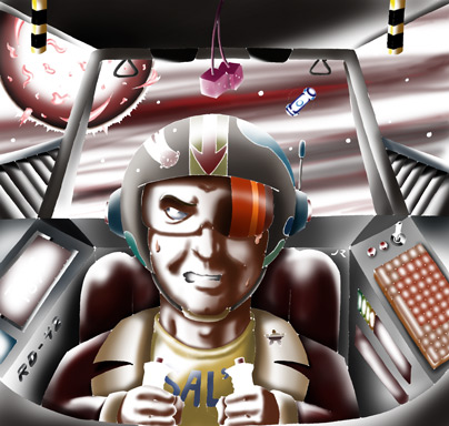
So here's the shaded version of the artwork:
Although it looks a bit dark and still kind of flat, that's because I haven't added in the highlights yet. At this point, the rendering is only half-done.
A few things I'll point out:
- The sun is partially shaded. This is to help make the core glow, and give a sense of roundness to it.
- Even though the sun is the main light source, I threw extra light onto some parts of the drawing so you could see them. For example: his jacket sleeves, his t-shirt, the engine vents, the right side of his face, his hands, and so on. Most of these would be in shadow if I shaded it realistically. But that's the great thing about art - you can cheat.
- The cockpit control panels "glow". I did this by shading the outer edges of them slightly, so it looks like there's a light source inside them. If they were just solid, they'd look like they were colored - not illuminated.
- I wanted to add a sense of depth to space. Black just looks flat. So I decided to add some clouds out there, and I made them red because I wanted to add more heat to the scene - as if space itself were on fire. To make them all seem part of the same group, I selected everything that made up "space", and drew the clouds all at once. If you're ever drawing space, check out pictures from the Hubble space telescope. Space is a lot more colorful and interesting that we usually give it credit for.
- His seat and jacket are quite dark now, and his helmet is well shaded, too. This is because I want to highlight his face more. That and the sun are the two most important elements in the picture.
- The fuel pod doesn't have much shading on it. I plan to make it glow, as all good fuel pods should.

- There's a little chrome in the cockpit. The border around the TEMP 107° display, the RD-42 lettering, and the little joystick next to the keyboard. Chrome tends to work best in small doses. The chrome isn't finished yet - that will come with the highlighting. The same applies to the gold star on his collar.
- I added black stripes to the eject handles. They make a bit more sense, now. I also could have added them to the Color layer since they're just flat black.
And here's just the shaded layer:
Looking at the shading layer by itself is a good way to check to see if you've missed anything. It's very easy to overlook small shapes.
Note the part of his face where the Goggles layer will provide the orange color. I could have used the same transparency effect with the entire goggle lens, but I would have needed to adjust each of the reflective sections separately to get the right colors. It's just a different way of accomplishing the same thing.
Next time... Bonus tutorial!
2 Comments
Recommended Comments