

Incoming! part 2
Entry posted by Nathan Strum
2,678 views
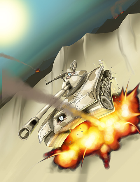
When we last left my Incoming! contest entry, I decided it needed a little something extra - an explosion! ![]()
The original artwork had the tank dropping into the scene, and bouncing off the sand dune. Since the tank was already in the air, and pieces were falling off of it, it lent itself very well to having an explosion underneath it, without having to do much additional work.
Painting an explosion is something it took me awhile to figure out. Once in awhile I'd manage to put one together that looked good, but it wasn't until my second Lead illustration where I came up with a formula for it.
The thing to think about with an explosion is: what's going on? An explosion is a rapid expansion of energy from the center outward. As the explosion builds, the initial part of the explosion picks up dirt and debris, expands away from the center, and cools. Meanwhile the explosion in the middle is continuing to build, generating more heat, and continuing to push the "older" parts of the explosion outward.
Visually, this results in a hotter, brighter center, and a darker, cooler outside. So I work from the outside-in, and build up the explosion in layers.
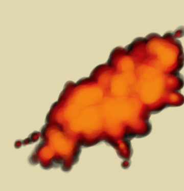
First, the darker, dirty outside. This is the smoke/dust cloud around the edges, and defines the overall shape of the explosion:
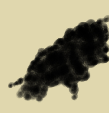
The explosion is painted on a separate layer, so I can work with it, erase it, change its transparency, and so on. I want to make sure that it blends in to the rest of the painting, so I didn't make the edges of it solid. It has to look like it's taking place in the desert, and blending in with the surrounding sand.
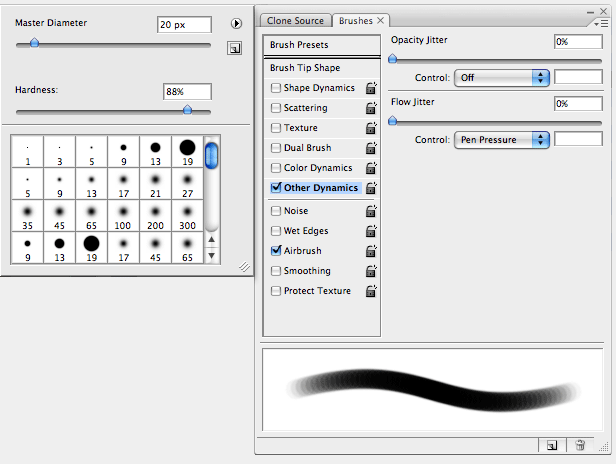
I paint using a Wacom pen (doing this with a mouse would be nearly impossible), and one of Photoshop's brush presets: Airbrush Soft Round 50% flow. Then, I modify it to have a somewhat harder edge. This gives me a nice, translucent, soft brush, perfect for clouds, dust, explosions, and so on:
While I'm painting, I'm using the [ and ] keys to increase and decrease the size of the brush. (I strongly recommend setting Photoshop's preferences so that the cursor shows the actual brush size - it makes it a lot easier to know what you're painting.)
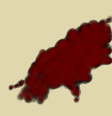
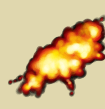
From the base layer, I continue to add in more layers, using the same techniques. Starting out with a very dark red:
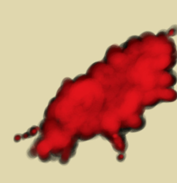
Moving onto lighter reds, I'm starting to put in the "structure" of the explosion. I want it to be uneven and have some areas of interest to it. So I decide what areas I want to end up hotter (more fully developed) and begin to make those lighter than the rest:
Next, oranges:
Finally - yellows, and at the hottest points, white:
After that, I decided to add in some flares shooting off from the main explosion. This is done using the Smudge tool, with a hard-edge, and around 85% strength. (This is also done on its own layer - just make sure the "Sample All Layers" option is checked.)
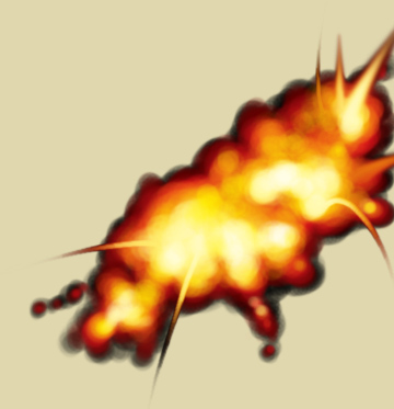
There are actually about nine or ten different colors used for the explosion. Working in layers allows for a lot more flexibility, and lets me go back in and fix things later. (Oddly enough, when I painted the original artwork, the explosion was all done on one layer, so I had to go back and re-paint it for this blog entry. ![]() )
)
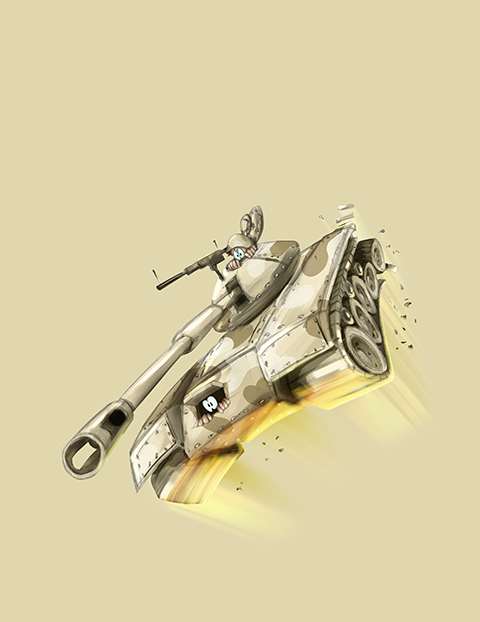
Next, the tank needed to look like it was being lit-up from underneath by the explosion. I created a new layer, and painted the lighting by hand, until it matched the apparent brightness of the explosion. (I painted it with the explosion layers visible, but here's the tank by itself to show the lighting more clearly):
And to make the rest of the otherwise-placid label work with the foreground, I added another explosion in the distance, and a couple of fires burning:
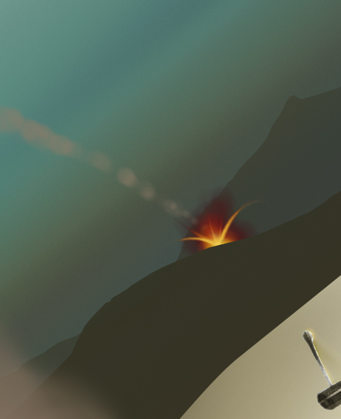
The smoke trails for this and the main missile were done using the same techniques as for the explosion. The difference is that I just used a smokey color instead.
Here's the final artwork, with explosions:
I was debating which of the entries to submit. The one with the explosion had more visual impact, but I really liked the concept behind my original one better. So I just submitted both. ![]()
Up next: part 3... of 2??
1 Comment
Recommended Comments