

Making Labels - Part 5

Entry posted by Guest
6,360 views
Part 5 - Shading: Bonus Tutorial
How to chrome almost anything
I was taught some of this stuff by a guy who used to work at GM designing cars. He could crank out a rendering of a car in 30 seconds that was better than anything I could do in 30 minutes. It was pretty humbling, but I learned how to draw chrome.
Here's the thing to remember about chrome: it's just a surface that reflects everything around it.
So what you're really drawing is the environment the object is in. Not the object itself. Generally, in 99% of the illustrations I've seen, chrome is done using the same basic formula. The artists don't usually draw an environment specific to their scene, but rather a generalized one. And it's almost always the same one - the desert.
The stereotypical desert used for chrome looks something like this: blue sky on top, fading down to white at the horizon. Then a dark line where the ground begins, fading to a lighter shade of dirt-brown as it gets near the bottom.
That's pretty much what all chrome (and for that matter, all reflective metal) looks like. The odd thing, is that even though it's basically just a formula, not only does it work, but it's actually pretty close to what you see in the real world. Next time you're behind a car in traffic, take a good look at any chrome logos or letters on it. The basic formula for chrome will be reflected in them. That's why the formula works - it's an abstraction of what we're used to seeing in the real world.
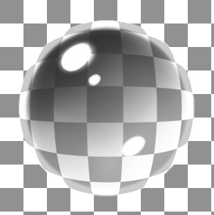
Here's a look at a chrome sphere, but in black and white:
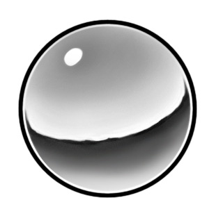
These are the basic principles at work:
- Darkest at the top. The top of the sphere is reflecting the highest part of the sky.
- The sky fades down to a thin white band just above the horizon. That's due to atmospheric haze, or atmospheric perspective.
- Thin, dark horizon line. Note that it's not smooth. Why? It's a reflection. Horizons are rarely perfectly flat. Throw a few distant mountains in there and it will look more realistic.
- Below the horizon line, the ground gets lighter as it gets nearer to you. The bottom of the sphere is reflecting the ground that's closest to you.
- The reflection follows the shape of the object. The sphere is round, so the reflection will bunch up as it goes around the sides of the sphere.
- There's a sharp, bright highlight in the sky. Somewhere in there, your light source (in this case, the sun) must be reflected. If you have an object with multiple edges, those edges will all pick up the light source and reflect it, too.
- A white highlight running around the edge. Ambient light tends to bunch up around the edges of chrome objects. This really helps sell the look of chrome.
The colors themselves can change, depending on what kind of metal it is. The black and white sphere shown above could be used to represent silver, since silver will often not reflect color to the same degree that chrome does. It's a bit of a cheat, but it works.
If you take the above principles, and apply different colors, you can end up with a whole variety of colored metals:
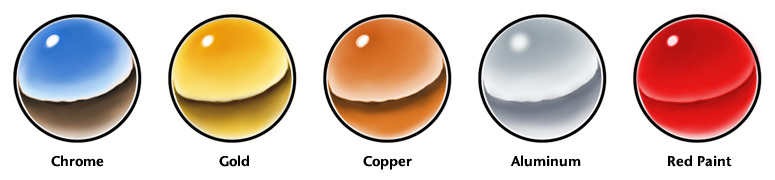
Note that with the aluminum, the highlight is more diffused, and the contrast is lower. That's because the surface of aluminum is generally more dull than other metals. With painted surfaces, the contrast between the light and dark areas won't be as strong since paint, although shiny, isn't as reflective as chrome.
Something else to remember with chrome - what is a particular surface reflecting? Is it primarily reflecting the ground, or the sky? Let's take a look at a hubcap:
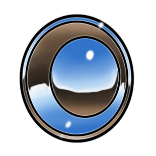
Because of their convex surfaces, the outer rim and inner dome will reflect the sky on their upper halves, and ground on their lower halves. But the rim in-between them is concave, so it's upper half is pointing at (and reflecting) the ground, while it's lower half reflects the sky.
If you're making chrome letters with beveled edges (a common application for chrome), then the bevels on the top of the letters will be reflecting only sky. The bevels on the bottom of the letters will be reflecting only ground. Keep in mind what a particular surface is pointing at - that's what it will reflect.
The best way to learn to draw chrome, is to take a chromed object outside, and draw it. Get up close to it, and see what's reflected in it. Then draw that reflection. Learn to break it down into simpler shapes, and note how it follows the surface. What happens when it reaches an edge? In shading, you have to learn to follow the light across a surface. With chrome, you're learning to follow a reflection across a surface.
Glass
Glass is almost always going to reflect highlights. The shape of the highlights depends on the shape of the glass, and the shape of what's being reflected. If it's a flat window, the highlights may be stretched all the way across it, since the window may be reflecting a large part of the sky instead of just the sun. If you have an object that's glass on all sides (such as a sphere or cylinder), you will probably also see highlights through the glass, reflecting off the inside of the far surface.
Usually, with a glass object, the heaviest shading will be on the side nearest the light source. The reason for this, is that although you're going to see a very strong highlight there, most of the light is passing through that part of the object. Where you'll see the most light overall is on the opposite side of the glass, since the light is being diffused through the glass and reflected more by the opposite side of the object, than by the near side.
Glass also refracts light. That is, it distorts the light as it passes through it. Seeing an object distorted through glass is a good way to "sell" the fact that something is made of glass. With a sphere or similar object, light will tend to bunch up around the edges where the glass is thicker (or more accurately, where there is more glass for the light to pass through).
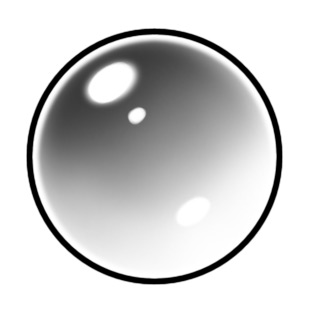
This is a simple glass sphere. There's nothing behind it, so it really doesn't appear very "glass-like":
But if I take the exact same sphere, and add a distorted background to it (and remove the outline), I end up with this:
So glass, like chrome, is defined by everything around it first - what it's reflecting and refracting. Any inherent color it may have is secondary.
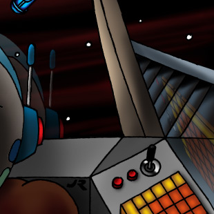
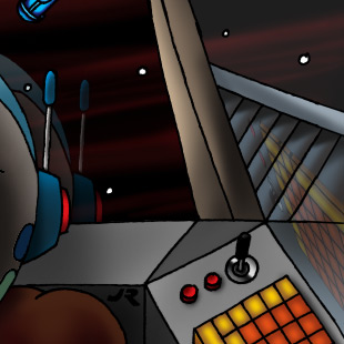
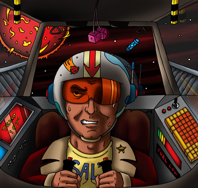
For the Solar Plexus label, I wanted to make the cockpit feel more "real". Like it was an enclosed, somewhat claustrophobic space. To accomplish this, I felt the windows needed to be seen. Without them, the cockpit appears to be very large and open.
The trick here, is how to do that? Distorting the outside of the ship through the glass would probably be too distracting, plus flat glass isn't going to distort much anyway. So reflections were the answer.
I decided to reflect the back of the pilot's helmet, the dice, escape handles, and the little triangular things hanging down from the ceiling. Those are all inside the cockpit, near the windows, and would naturally reflect in any glass there. To get more reflections on the side windows, I decided to also reflect a couple of the glowing control panels.
To make the reflections took a few steps. First, I needed to make a layer that was a composite of everything I had rendered and colored so far. With everything on separate layers, I couldn't just grab an object and make it into a reflection. (The key to this is keeping your existing layers intact, and creating the composite as a copy on a new layer.) Once I had a copy of the whole illustration on a single layer, I was then able to cut out the pieces I needed, and manipulate them. I used the Transform command to move, resize and skew the pieces until they looked like they were where reflections would be.
Next, I had to make a mask, so that the reflections would only be in the windows - not overlapping anything. This was done just like every other selection so far, except instead of a temporary mask, I made it into a layer mask. When you create a layer mask, everything you have selected will remain visible, but the rest will be hidden.
Layer masks are grayscale. The areas of the mask that are white will show anything that's on the current layer. The black areas are opaque, and block out anything on the current layer. Anything gray will be semi-transparent. You can add layer masks to any layer (including adjustment layers), and even go in and paint on the masks to change them, if you want to make more areas visible or hidden. This is really handy, since you can effectively "erase" areas of a layer, without actually removing any pixels. You're just blocking them from being seen.
This is the mask for the windows:
Think of it as a window for your layer. The white parts are the glass that you can see your layer through, and the black parts are the window frame that you can't see through.
To create a layer mask, make a selection, then click on the Add Layer Mask button at the bottom of the Layers palette. It will create a mask out of that selection, and apply it to whatever layer is currently active.
This is what the reflections layer looks like, with the layer mask applied (shown over a white background):
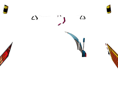
The various pieces (helmet, dice, etc.,) are still fully intact. The mask allows me to move them around as needed, but restricts them so they only appear in the windows.
Although the reflections were in place and masked out, they were still completely opaque. So I reduced the opacity of their layer until they were mostly transparent:
Line art by Jess Ragan
Even then, the side windows weren't "reading" very well. So I added an adjustment layer for the side windows that lightened them up a little:
This helps sell the idea that there are windows on either side of the pilot. I didn't make the effect very strong though, since I didn't want it to block out too much of what was going on outside. I didn't do anything else to the back window, since that's already pretty well defined.
So, with the windows in place, here's what the label looks like:
Next: We start wrapping things up with highlights and some special effects!
0 Comments
Recommended Comments
There are no comments to display.