

Entry posted by Nathan Strum
1,888 views
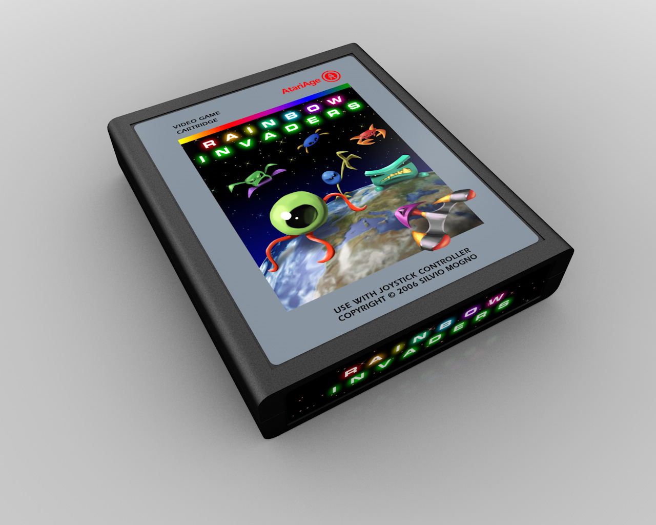
Rainbow Invaders (2006)
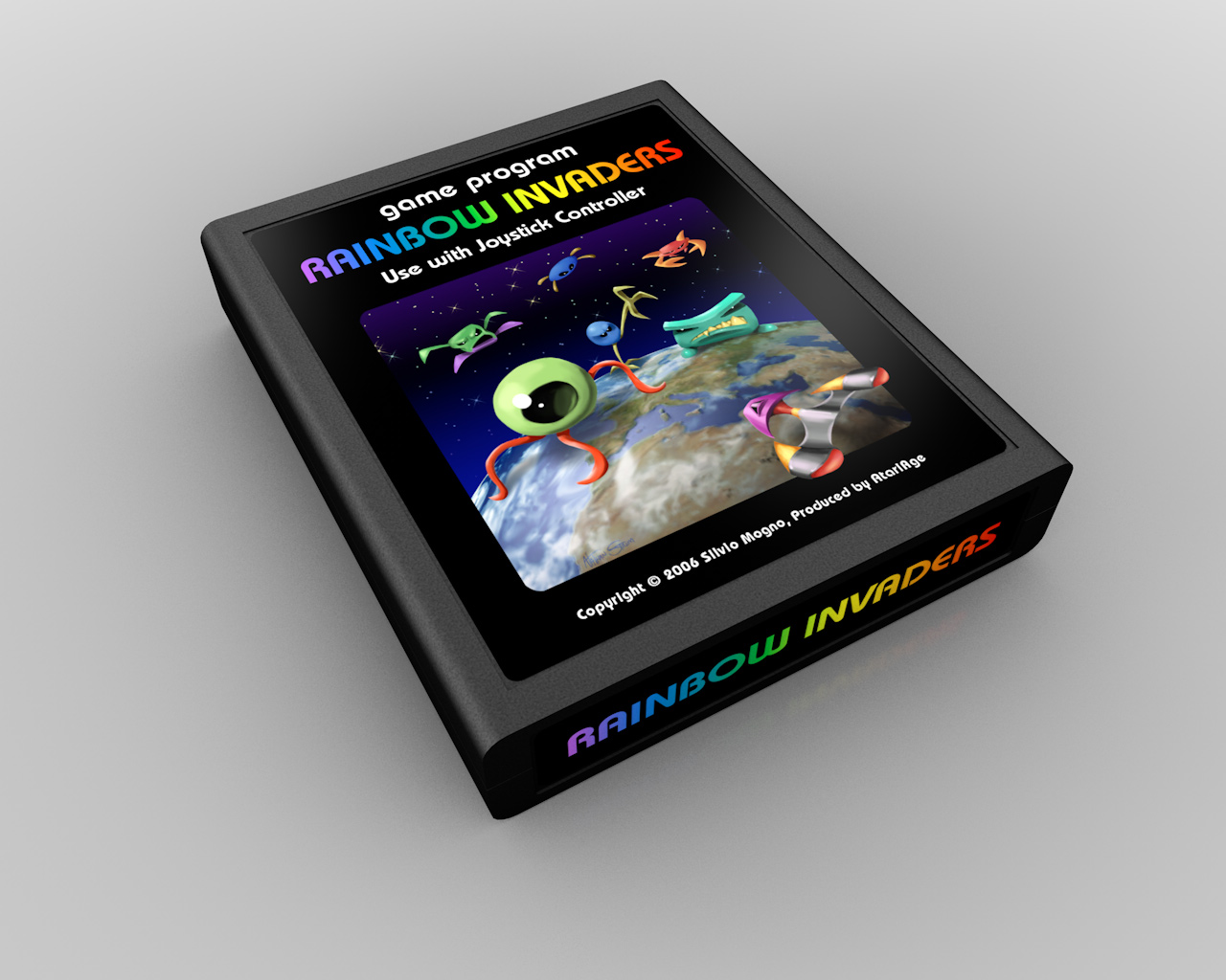
Rainbow Invaders - my fourth contest win - is Silvio Mongo's excellent re-imagining of Space Invaders with multi-colored sprites and a ton of power-ups.
While I'm not particularly fond of using Atari-style labels, I still like the painting quite a bit, although it could certainly have benefited from a few more revisions. Some of the characters could use refinement - a clearer structure or a few additional details (better defined limbs, for example).
I've never thought this game got quite the attention it deserved. It's a really solid Invaders game with enough unique features to distance itself from others of its kind. I always wondered if the name held some people back from buying it, since it doesn't really imply an action game. He chose the name because of the multi-colored graphics and the important role color plays in the game. Maybe Spectra Invaders would have been better? ![]()
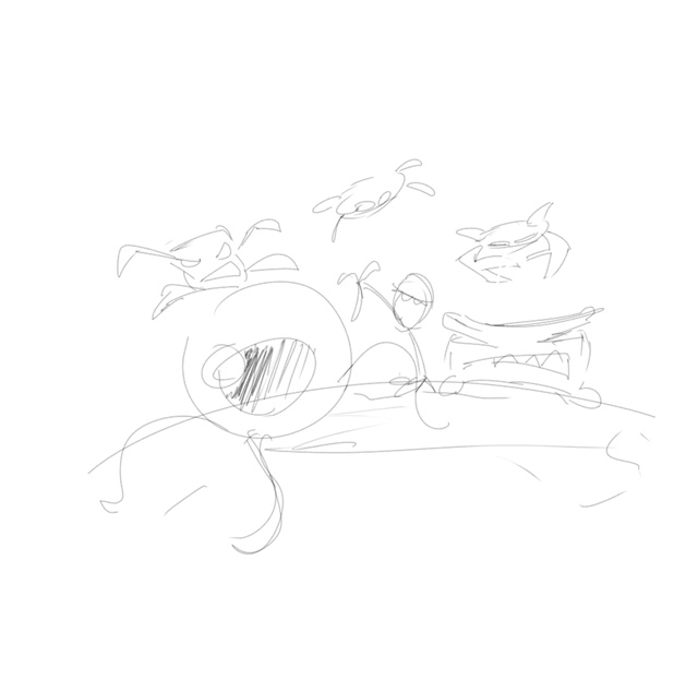
I had worked with Silvio on the game's graphics, so when the contest came around, I already had a picture in my mind of what the aliens would look like in "real life". His original invaders are on the left half of the screen, my revisions are on the right:
![]()
Looking back at the label's files, they all appear to be from Photoshop, however I know I drew and painted them in Painter. But - Painter allows you to save documents as Photoshop files, so I think that's what I did instead of using Painter's native file format. Sometimes certain paint effects only remain editable if you save the document as a Painter file. But in this case, I must not have been using any of those tools.
Each Invader was drawn on a separate layer. They're pretty literal translations of the sprites, which works okay for most of them, but not so much the top-most and upper-left one. They're just not as fully thought-out, relative to the other ones. In hindsight, I suspect that I didn't spend more time on them because this was intended for a contest. For a for-hire label, I probably would have spent more time refining the designs. But once the label was finished for the contest, it was basically done, and I probably didn't give much thought to going back and re-doing large chunks of it.
The logo and spaceship were, for some odd reason, drawn in a completely separate file. Not just on different layers. Later though, I'd bring all the layers together into a single file.
![]()
Each element was painted (in Painter) on its own layer. Besides allowing me to move things around, it also let me re-use them in the manual as spot illustrations (Tony Morse did the layout for the manual, and I went through and added the illustrations and tweaked some formatting).
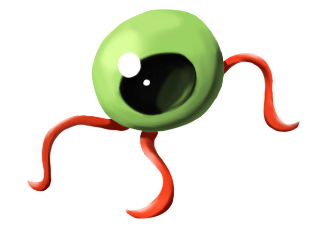
My favorite of the bunch is the eyeball. It's a clean, simple illustration, and I really like the painterly look of it. Plus the visual of a giant eyeball walking around on its optic nerves (or veins) is just a lot of fun:
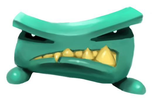
My other favorite is the short, squat guy with the big teeth. For both of these, translating the sprites over to an illustration worked really well. Sometimes it doesn't, and you just end up with a boring drawing of a sprite (like the aforementioned two at the top of the illustration).
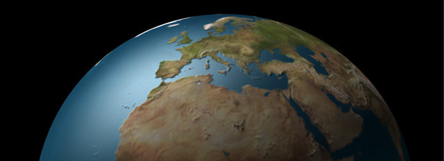
Instead of trying to paint the Earth, I used Carrara to render a 3D version of it. This saved me a lot of time, plus it allowed me a bit of subterfuge. Since Silvio is from Italy, I decided to rotate the planet so Italy was prominently centered in the label. ![]() I don't know if it helped or not, but I figured it couldn't hurt my chances in the contest:
I don't know if it helped or not, but I figured it couldn't hurt my chances in the contest:
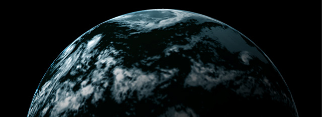
The clouds were rendered out in a separate pass. This allowed me to more finely adjust them (or erase ones obscuring Italy ![]() ) in Photoshop:
) in Photoshop:
The stars in the final label was created using the Constellation filter from the now-defunct Xenofex 2 Photoshop plug-in from Alien Skin. It allowed you to define size range, density, flare effects, and more. It was a really handy tool, and I hope they bring it back someday.
Contest Entries
This first one was the closest to my sketches. The Rainbow font was hand-drawn in FreeHand, and I don't really care for it - it's too cartoony for an action game. I think I was trying to contrast the words Rainbow and Invaders too much, instead of finding a way to unify them. The Invaders font is Eurostile Bold Extended 2. Note that the blue-egg invader with the long legs has been flipped from the original sketch. When he was facing the other way, it looked like he was trying to attack the eyeball. This way, it looks more like he's alongside the squat guy with the teeth. And yes, there's more than a little Y-Wing fighter in the inspiration for the player's ship, but in all fairness, that's what it looks like in the game, too. ![]()
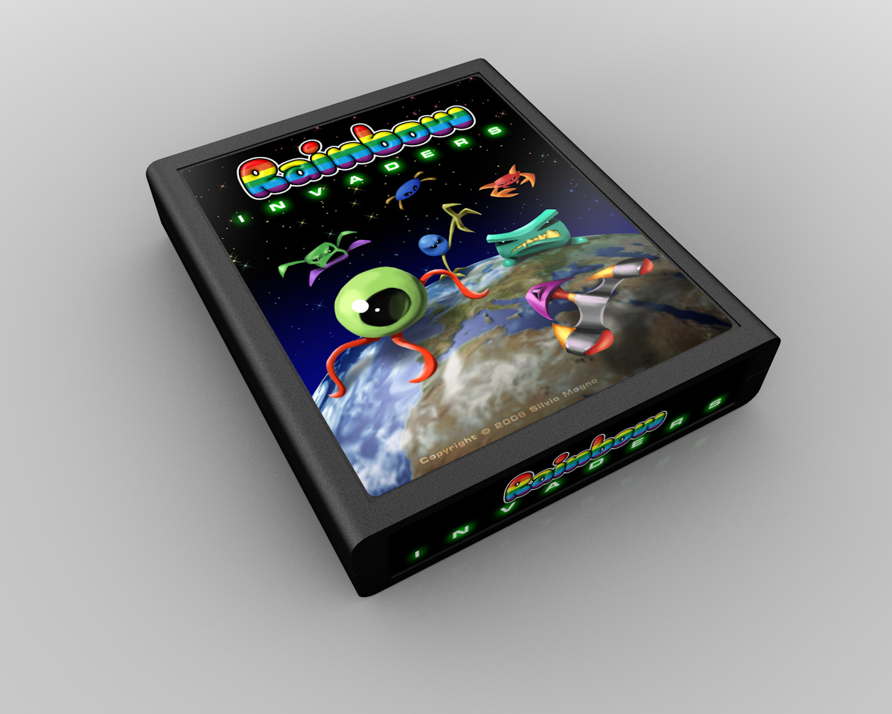
The winning label. Although for the final, the text treatment was changed to match a different entry at Silvio's request. Also on the final is my signature, which I hadn't included on the contest entries. At the time I was still getting used to the idea of stamping my name on someone else's game. But after this, I felt since it was my artwork, I should at least claim responsibility for it. ![]()
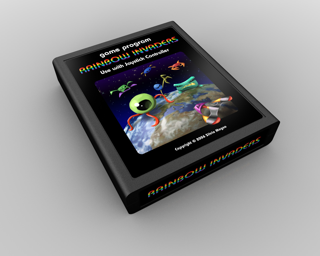
And the obligatory silver-label variation:
Well, that's 10 down... ![]()
And 25 to go. ![]()
2 Comments
Recommended Comments