

Entry posted by Nathan Strum
1,454 views
Backfire (2003)
Backfire was the second contest I entered (and lost). At the time, since I was still just getting back into drawing, I opted to make the label using 3D software (the long-defunct Infini-D) instead of illustrating it.
The different elements were rendered out separately, then combined in Photoshop so I could tweak transparency and position, and add effects.
What I was trying to go for was something reminiscent of the Imagic labels - where they kitbashed models and photographed them for their artwork (something I'd still like to do for an AtariAge label, someday). So this was intended to look more like plastic models, than full-sized space ships.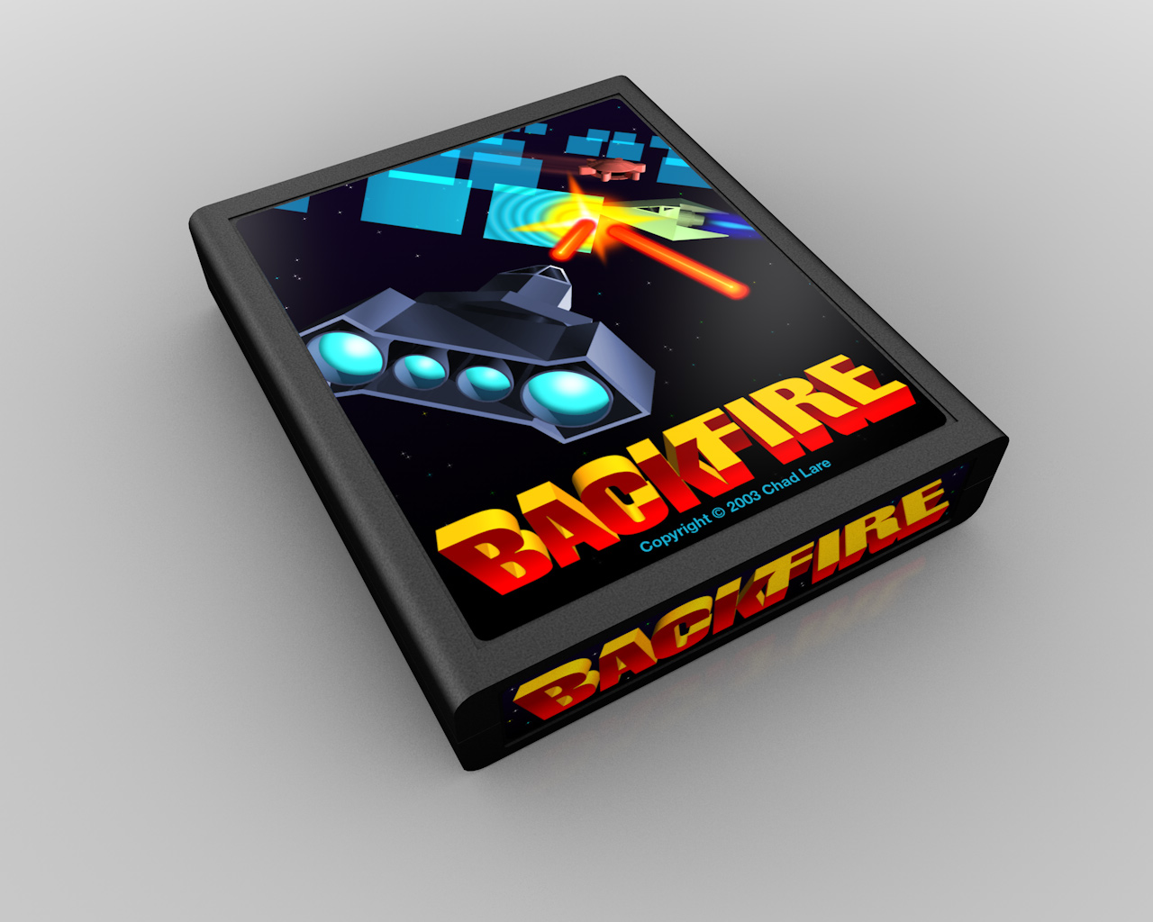
In hindsight, I didn't spend as much time modeling the ships as I should have. Or more truthfully, I just wasn't adept enough with 3D at that time to accomplish something better. They look rather bland, and the lighting and texturing are almost nonexistent. The whole concept of the Imagic-like artwork didn't come through in the final at all.
Besides that, the composition of the label is terrible. It's really hard to get a sense of what's going on. It's cropped in too tight, and the artwork is angled for no justifiable reason. Had I to do the label over again, I would have backed the camera out just a bit more, and altered the angle of it so it better complemented the placement of the logo and the edge of the label. That, and I would have also submitted it as a classic Atari-style picture label. But that's yet another story for a future entry. ![]()
That said, there is one thing I still really like - the logo. It was also created in Infini-D (Helvetica Compressed) and then overpainted in Photoshop. It does a good job of harkening back to classic arcade logos (like Defender), and really fits with the name of the game as well - the colors are appropriately fiery, and "Back" tilts backwards away from "Fire". It's also a nice bit of 3D illusion, where the the two words blend into each other, even though those planes can't actually touch.
I didn't do any sketches for this one (which is probably one of the reasons the composition is so bad). But going through the files, I did find an earlier version of the label that had different models, and also showed the other cannon on the opposite side of the playfield: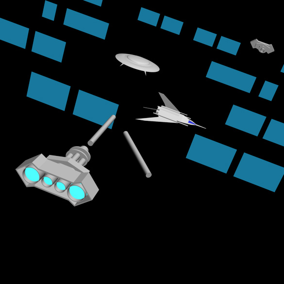
A slightly later version shows some coloring added to it, although the blue panels were cropped - probably because I was playing with the layout: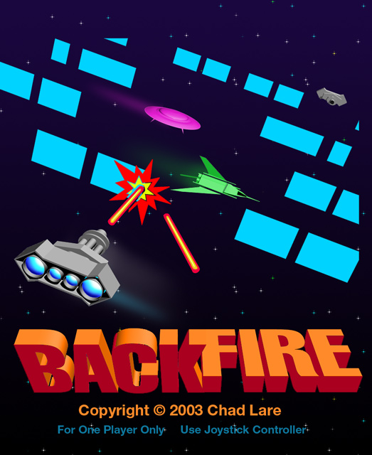
The composition is clearer than the final one I submitted, but very boring. So somewhere between the two probably would have been the right approach.
Something I'd completely forgotten about was that at some point, I was apparently contemplating doing a more illustrative version, since a couple of files exist of just outlines.
This one is particularly interesting, since it has lines of varying widths, the explosion and logo. So it's pretty far along. For some reason, I decided not to pursue it any further, but I wish I had, because I like the look of it better.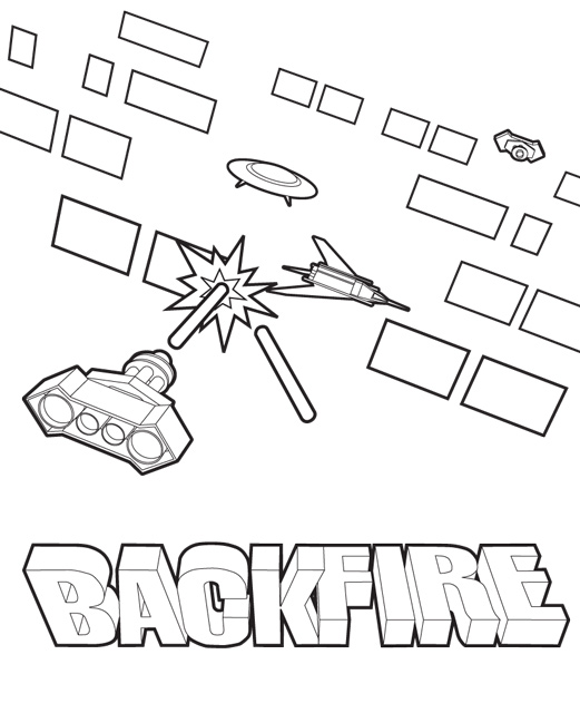
Speaking of illustrations, my favorite label in the contest was Dave Dries'. Even though he didn't win, he'd later revisit some of the concepts in the label for Juno First.
-
 1
1

0 Comments
Recommended Comments
There are no comments to display.