

Entry posted by Nathan Strum
2,395 views
Go Fish! (2005)
This was the sixth label contest I'd entered, and with it my three-contest winning streak came to an end. But it was a good run while it lasted. ![]()
Go Fish! is Bob Montgomery's take on games similar to Intellivision's Shark! Shark!
I started with sketches in Painter. Each element was drawn on a separate layer so I could move them around as needed.
Note in the first sketch there's a giant shark head looming in the background. I'd eventually move this into my second contest entry instead. The reason being was that as I worked on the first one, the shark became too distracting. Since the second one had a tighter composition (and fewer elements), the shark worked better there. (Turns out this wasn't a particularly original idea, but at the time, I don't think I made the connection.)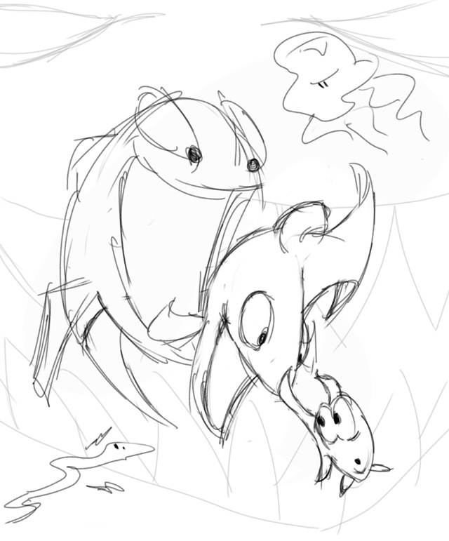
From there, I took the sketch into FreeHand to re-draw the outlines as vector artwork.
Go Fish! marked a bit of a milestone in how I created illustrations. Previously, when I worked in FreeHand, the shapes were all "filled" with white. In other words, everything was opaque when I brought it into Photoshop.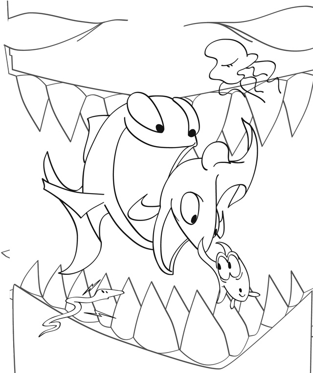
With Go Fish!, I changed how I worked, and instead created everything to be transparent. Just the lines were opaque. The line art looked the same against a white background, but transparency brought a huge advantage when it came time to color the artwork.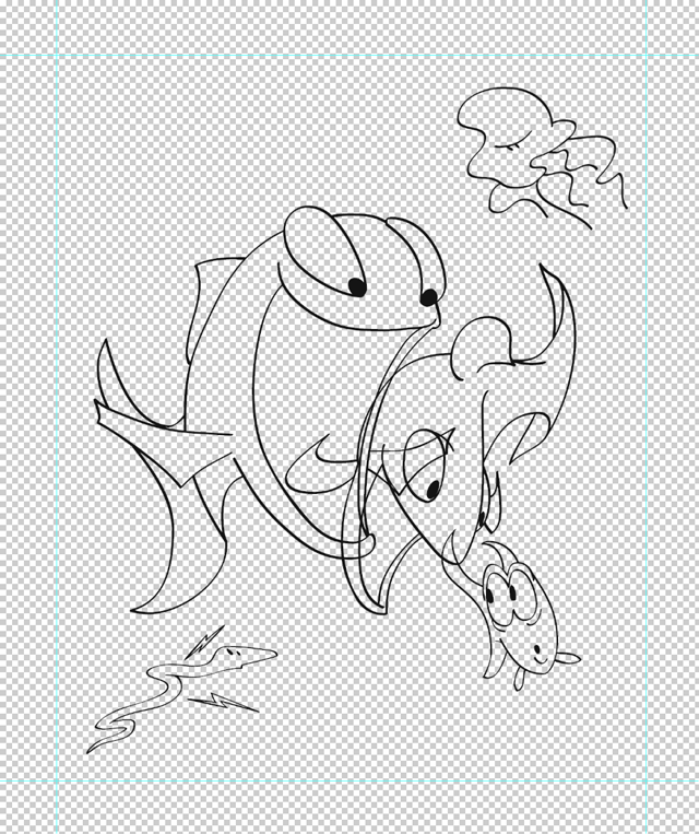
When I color areas in Photoshop, I use the Magic Wand tool to select an area to fill or paint. In order to not have fringes around the edges, the selection has to cut into the outlines a bit. This works because I'd color on a separate layer, leaving the lines intact. But I'd still have the opaque white to deal with on the layer with the lines. So this meant changing how that layer is composited with the others. I'd use Multiply, which effectively makes white transparent but makes any non-white pixels multiply their value with any layers behind it. So if I tried making a red outline, it would show through any colors behind it, darkening or changing the red altogether. In short - I could only really use black outlines, since you don't notice the effect.
But making an image where only outlines existed allowed me to color the lines, since I didn't have to use Multiply to get rid of the white. The outlines could be completely opaque, and I could color them any way I wished. This is something you'll see a lot in animation and animation-related artwork (posters, DVD covers and such), and has a more refined look than black outlines.
Here's just the colored outlines: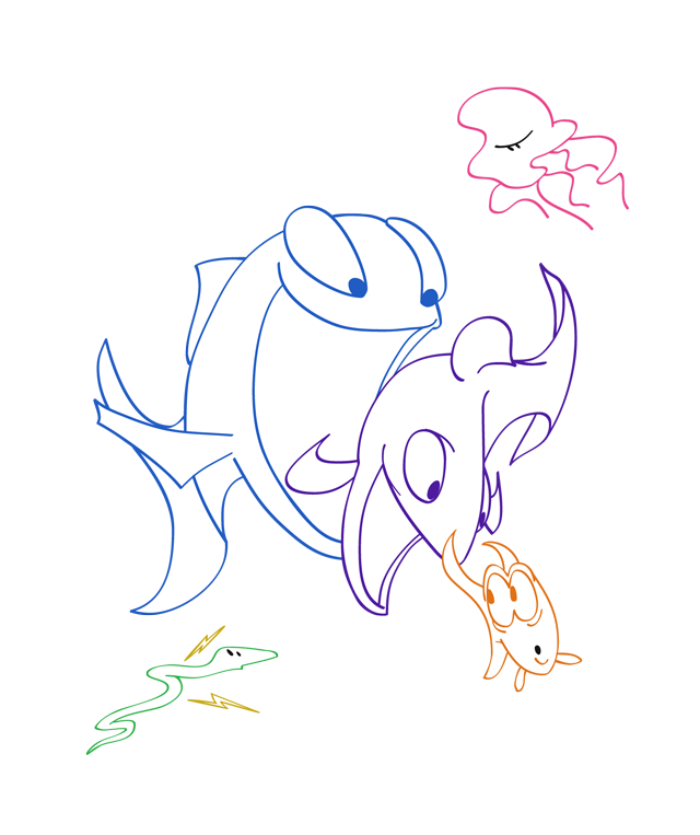
This shows just the flat-color without the outlines, and gives an idea of how far into the lines the coloring goes (something I'd use to a different degree in a future label):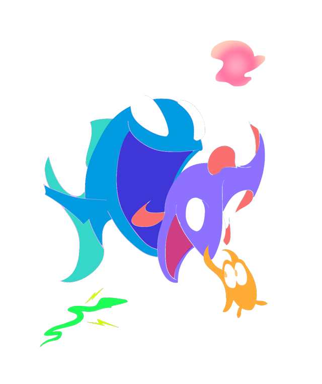
The final shaded characters, with colored lines: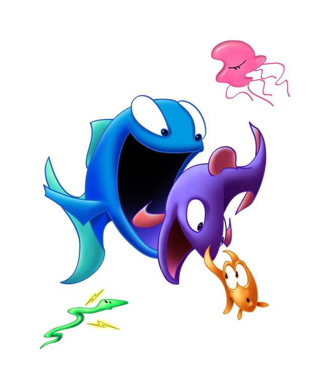
The lines are opaque, and sit on the top-most layer for each character. The characters themselves are in separate groups of layers, so they can be adjusted or moved as needed.
Working in FreeHand allowed me to make simple lines, and then apply a variable-weight line to them, to mimic a pen-and-ink drawing: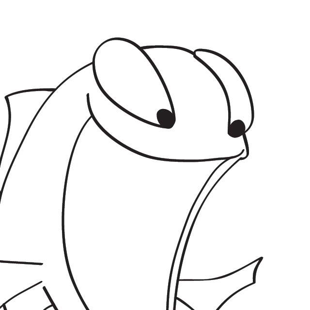
However, FreeHand has been long-abandoned, and no longer even runs on my Mac. Fortunately, Illustrator CS5 is able to import FreeHand documents. But it doesn't quite fully support some of FreeHand's effects, including the variable-weight line. Instead of a nice, clean line, it turned them into shapes. The problem with that, is shapes are harder to edit if you want to change something: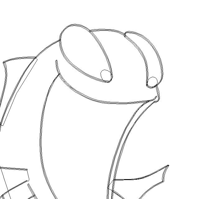
Fortunately, the original lines are still intact, just without any weight to them.
So for any of these old FreeHand files I want to open and re-edit in Illustrator, I have to go in and delete all of the shapes, so only the lines remain: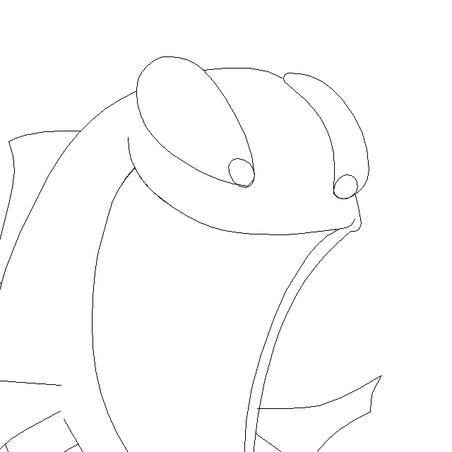
Then I can apply Illustrator's own variable-weight line to it, effectively restoring the look of the original document, and making it fully editable again: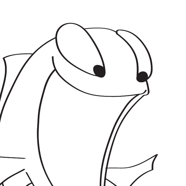
I had to go through and do that to all of my Artie the Atari artwork when I transitioned to Illustrator.
The process for the second illustration was the same. Sketching it out in Painter: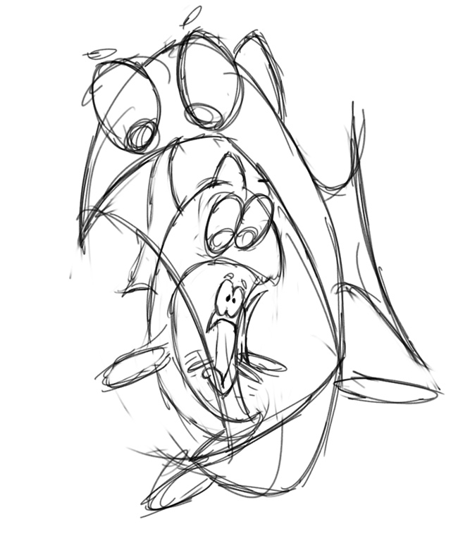
And "inking" it in FreeHand. Note the addition of the shark face. In the final, I ghosted it into the background so it wasn't so obtrusive.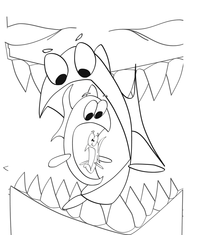
I still really like the little fish. He seems to be the only one of the three aware he's in danger, and I can picture his little fins madly flapping away as he tries to escape.
I had started a third sketch as a joke entry, but never took it very far. Recognize the two dead fish?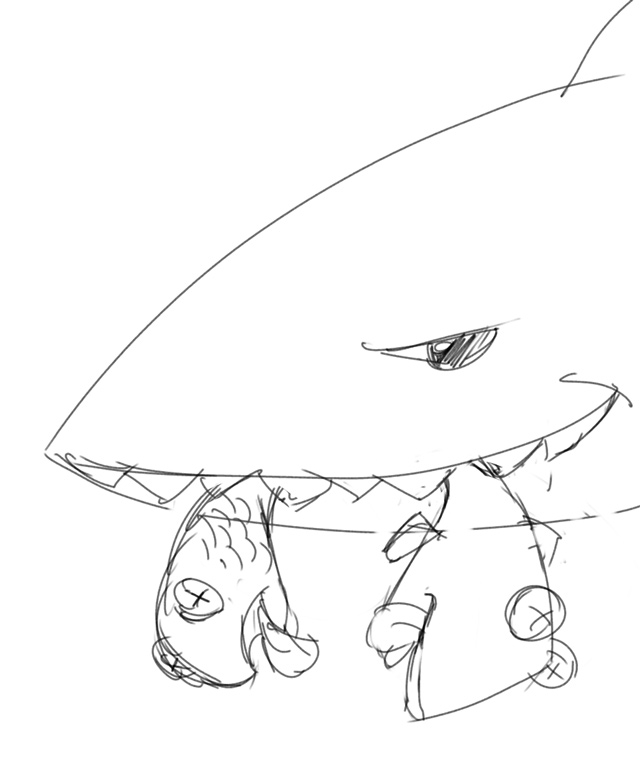
They're Pesco and Funky Fish. ![]()
This is the final contest entry for the first illustration. I still really like the look of it. It has a very clean, airbrushed look to it, akin to animation movie posters of the time (which was my intent). I also really like the translucency of the jellyfish, and the simplicity of it and the electric eel. Sometimes I need to step back and just have fun with quick, little drawings, and not worry so much about making needlessly complex or overly detailed illustrations. Simpler is often better. That said, the logo is a bit too simple. It's a slightly distorted Helvetica Rounded Black, but I think something more interesting could have been done with it. Maybe make the letters thicker and more rounded. I still the looks of the two larger fish, but I think the smaller one is a bit too head-on. I'd have him turning back more towards the other fish if I were to do it over. 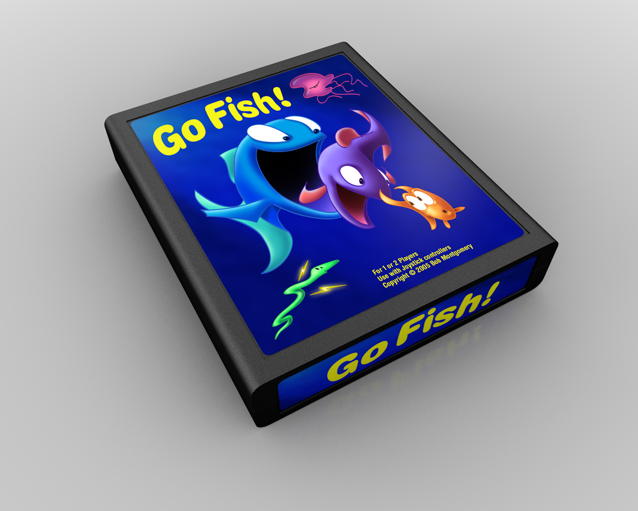
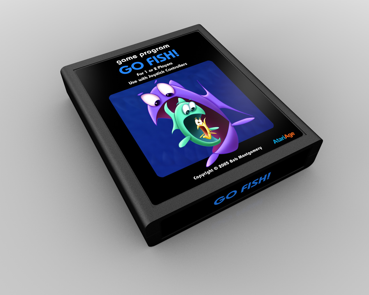
For the second entry, I used Sand Regular as the font, and added a bit of a water effect to it. I think the other logo is actually better, but I like the water effect on this one. Maybe some combination of the two would have worked. The shark is ghosted so far into the background I'm not sure most people would even see it. I suppose if I pushed it that far back, it probably means it wasn't a very good idea to include it in the first place. ![]() In hindsight I'm not all that fond of the middle (green) fish. I think it could stand to have a bit more personality to it. Maybe a more interesting, contrasting shape.
In hindsight I'm not all that fond of the middle (green) fish. I think it could stand to have a bit more personality to it. Maybe a more interesting, contrasting shape.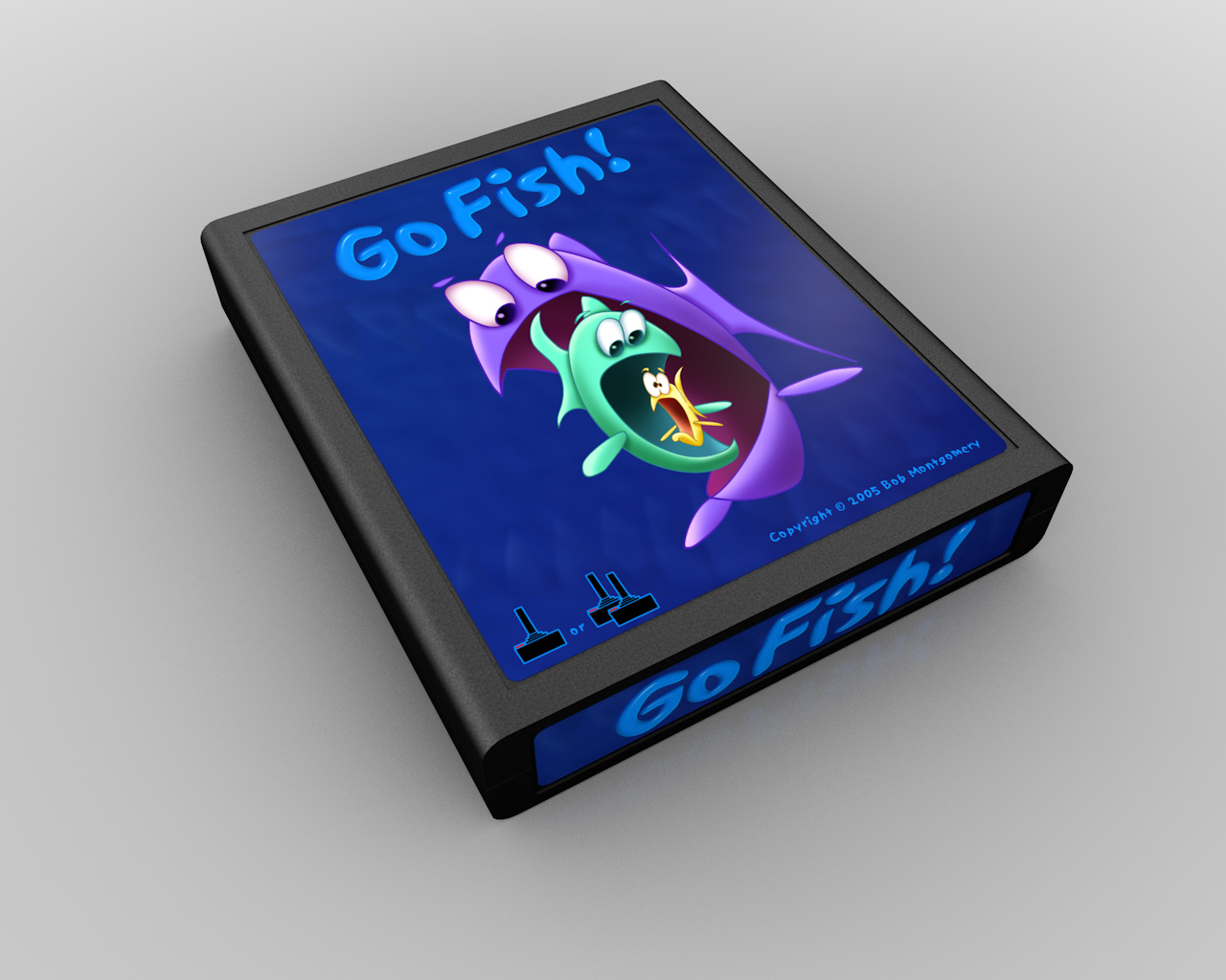
And of course, the inevitable Atari-style variations.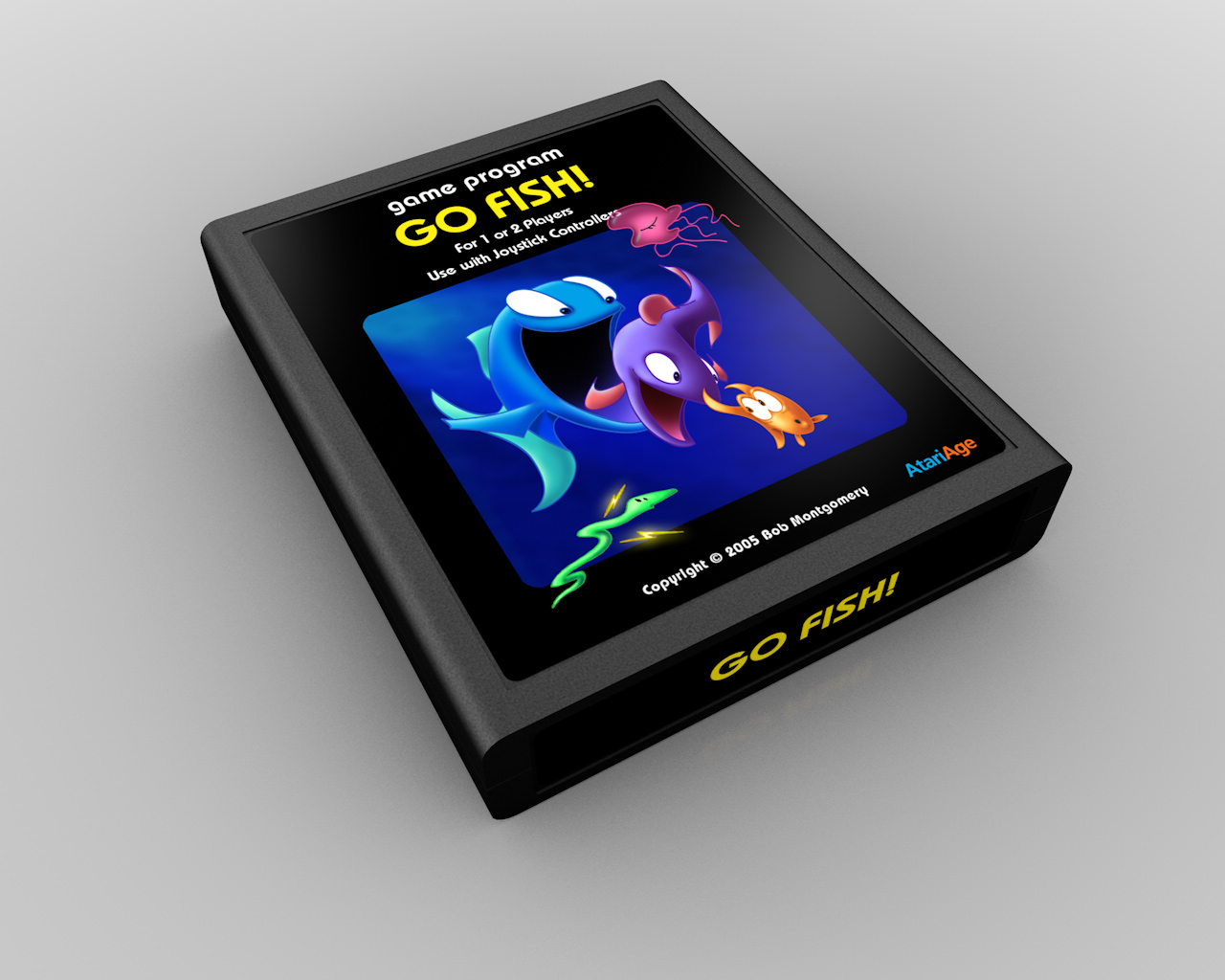
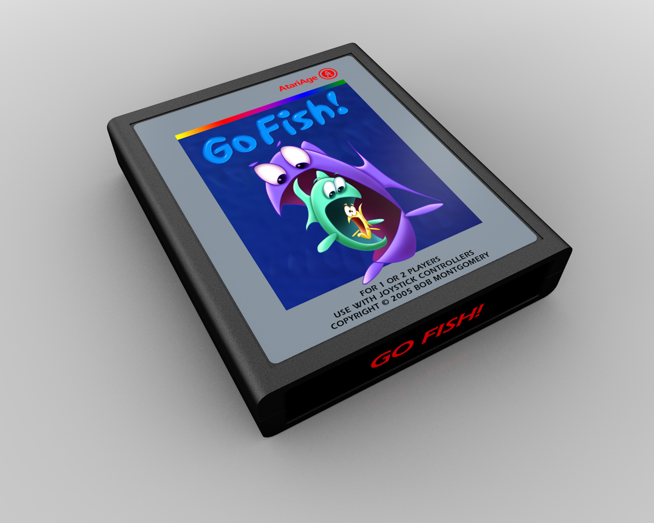
Even though I'm not a big fan of aping Atari labels, I do like the silver label variation here. Mainly because it effectively shows off the translucency of the jellyfish. But that end label font (Eras)… yecch.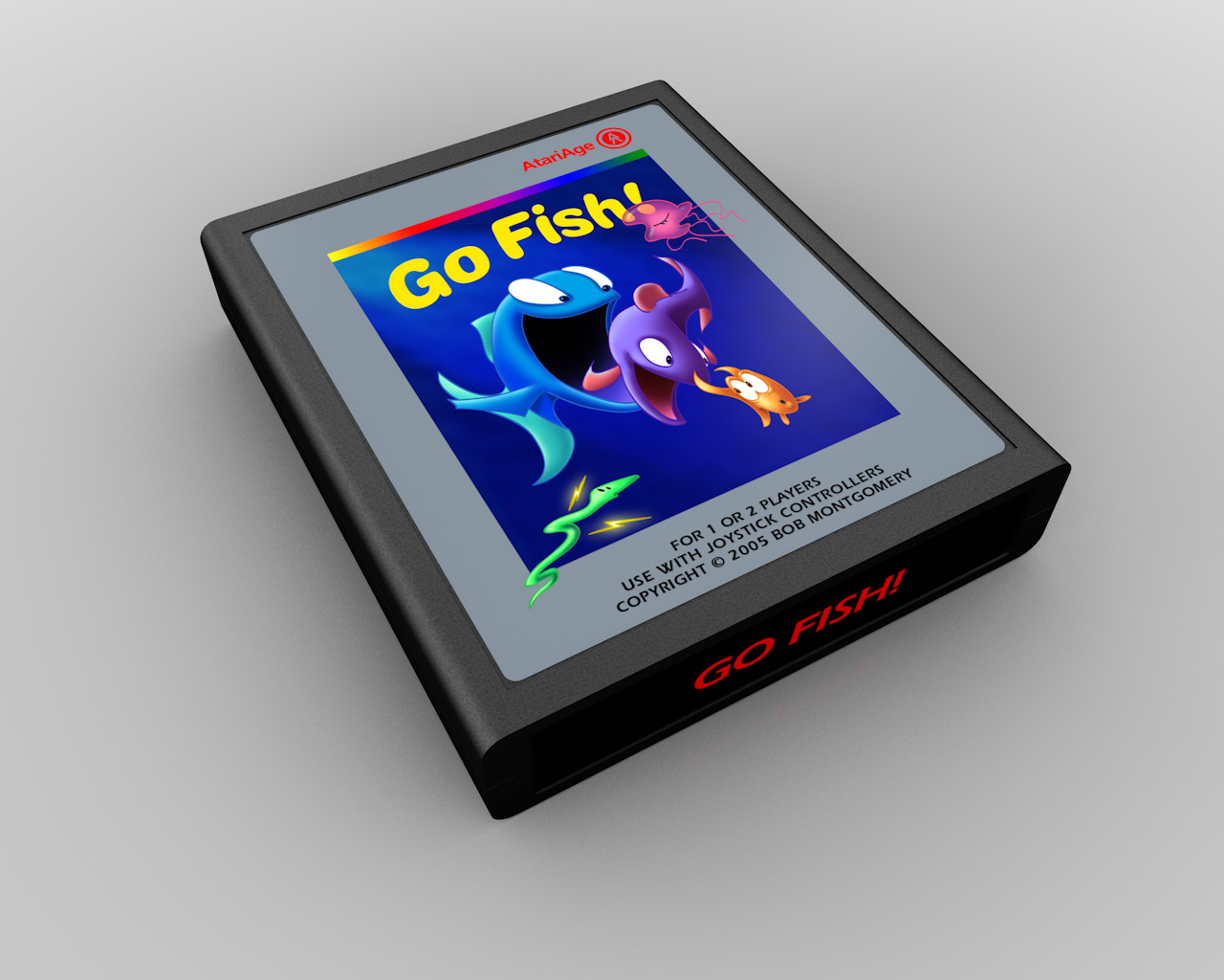
Up next: a significantly shorter entry!
0 Comments
Recommended Comments
There are no comments to display.