

Making Labels - Part 3

Entry posted by Guest
1,238 views
Part 3 - More Coloring
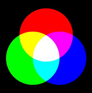
Color Space
This is probably a good point to mention color space. A color space defines what primary colors are combined together, and how they're combined, in order to make a full range of colors.
RGB (red, green, blue) is what you see on your computer display.
CMYK (cyan, magenta, yellow, black) is what printers use.
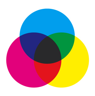
Technically, this image is only CMY. But it's a good comparison against RGB.
Printers can not print all of the colors that you can see on your monitor. Intense greens, bright cyans, and other colors simply will not print the way that they look on your computer. The reason is because the two color spaces create colors in completely different methods.
RGB uses transmitted light to create color. RGB is called additive color, meaning the various hues of light are combined to create the final colors. 100% red + 100% blue + 100% green = white. This means if you see something red on screen, you're getting blasted in the face with red light. RGB can create extremely bright, intense colors as a result.
CMYK uses ink, printed on paper, and is seen as light reflected off its surface. You can't have any color brighter than the brightest ink, and as you mix colors together, you lose brightness. If you make a color lighter, it doesn't get any brighter - it loses intensity, because you're using less ink pigment to print it. CMYK is called subtractive color, and it's the opposite of RGB. With CMYK you wouldn't see red light, you'd only see pigments that reflected the red part of the light spectrum back to you.
The problem happens when you take a document that you've colored in RGB, and try to print it to a CMYK printer. The printer can only approximate the RGB colors, and usually makes all sorts of really unfortunate choices about it. This happened with the Warring Worms label. The thumbnail at the top right of the product page is a copy of the RGB image - not a photograph. But if you look at the photographs lower on the page, the background has changed to a bluish color.
To avoid this, I could have worked in CMYK mode in Photoshop. (It's actually simulating a CMYK color space, because computer monitors are always RGB.) This would have given me an idea of how the colors would have printed out, and I could have adjusted them accordingly.
Maybe.
You see, the labels printed out on my printer just fine. It wasn't until Albert tried printing them out that we ran into problems. This brings up the other issue with color space.
There are more than just two color spaces.
There isn't any single RGB or CMYK color space. There are dozens, if not hundreds of them. In fact, you can custom make your own in Photoshop. Why? Well, because all monitor manufacturers make their monitors different, and all printer manufacturers make their printers different. So each has its own unique color space.
This makes creating color artwork on a computer and getting it to print out even remotely the way you wanted it, a difficult proposition at best.
Now, you can adjust a printer's settings when you print things out, and that will help some, but some printers just can't print some colors, and adjusting them can be a huge chore.
So what to do?
Well, probably the best approach is to work in a generic CMYK color space in Photoshop. That way, at least you aren't trying to translate between completely opposite color spaces, and you have some chance of getting a decent print.
Or you can do what I do. Work in RGB, live dangerously, and thrive on disappointment. ![]()
Color theory
The problem with color theory, is that it's all completely subjective. Just watch any interior design/makeover show on TV and you'll find that out in a hurry.
You could study color theory forever, and not really get a feel for it. For example, I'm no better at color theory than I am at inking. I can recognize good color schemes when I see them, and understand why they're good, but creating one of my own is often an exercise in frustration. I think you either have an innate sense of color design, or you don't.
But I can throw a few suggestions your way.
First, figure out what you want to convey with your artwork. Is there a mood you want to set? Happy? Sad? Focus on using colors that convey that mood.
In the case of Solar Plexus, the pilot has this enormous, fiery sun bearing down on him. So I wanted to convey the sense that the pilot is absolutely surrounded by heat on all sides. I have a picture in my mind's eye of the whole cockpit bathed in this red light, with a hot glow emanating from everything. So as I'm coloring it, I'm keeping in mind warm colors. Most of the displays in the ship are orange and red, the ship is mostly warm gray, the pilot's goggles are orange, his jacket is a reddish-brown, and so on.
Second, don't be afraid to try different colors. And I don't mean a red shirt instead of a blue one. I mean purple trees, red skies, orange mountains, whatever. This is where I'm weakest when it comes to color - breaking free of reality. I tend to be a very literal colorist. If I draw a dog, I put brown fur on it. Not blue. But good color design doesn't often adhere strictly to reality. It breaks with it, in order to put across a mood, a message, or just to look really, really cool.
Third, watch cartoons. There are some great examples of color theory in animation. Here are a few suggestions:
- The Incredibles (or pretty much any Pixar movie) - These guys have mastered the art of using color to tell a story.
- Fantasia - Still one of the most groundbreaking animated films ever. Skip the 2000 version though. Stick to the original.
- What's Opera Doc? - This Warner Bros. cartoon is the best animated short ever made. Maurice Noble's design work is breathtaking, brilliant, and unsurpassed. I had the good fortune to have dinner with him a few times at a friend's house. What an amazing individual. Unfortunately, none of it seemed to rub off on me. Maybe I should've sat closer.
Anyway, think about your colors. Why you're using them. What you want the viewer to come away with when seeing them. And be creative when picking your colors. Don't be afraid to experiment. Remember, there's always "Undo".
Fixing
Back to the actual process of coloring.
Even with the selection method I showed in the last tutorial, there will be some areas that just don't get filled all the way. Usually, these are sharp corners or other detailed areas.

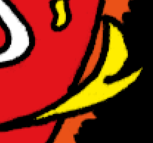
Line art by Jess Ragan
But since your coloring on a separate layer, this is super easy to fix. First, go to Select > Deselect to turn off any selections. Then just grab a small paint brush, choose a color, and just paint out the area that got missed (be sure the active layer is your Color layer). Since your outlines are on a different layer, you don't have to be terribly precise - you're not going to cut into the outlines, even if you paint "over" them.
Note that this is what you'd have to do if you used the Paint Bucket, but you'd be touching up the entire drawing, not just a few errant corners.
Masking
Next to layers, masking is the most powerful tool at your disposal in Photoshop.
You've already been masking stuff off using the Magic Wand tool. When you mask something, you're selecting a part of the image to edit, and everything that's not selected remains untouched. Almost everything in these tutorials hinges on masking.
It's time to make another Action!
- Use the Magic Wand to pick an area.
- Create a new Action called "Expand Selection". Photoshop will start recording it.
- Go to Select > Modify > Expand, and set it for the value you used for your Expand and Fill action.
- Stop recording.
What this will do, is just expand an area you've selected, and leave it selected. Selected areas are active, and the areas around it are masked off. That means anything you do (painting, filling, hue adjustments, level adjustments, etc.) will only affect the selected area, and only on the layer that's active.
Let's say you want to change a color that you've already filled.
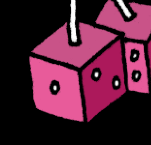
Line art by Jess Ragan
The first thing to do is turn off the Color layer before using the Magic Wand. This way, you'll be re-selecting an area while it's white. The reason for doing this, is if you've filled an area with a color, it now has different values, and the selection would be different. To keep the selection consistent, turn the Color layer off while using the Magic Wand.
Once the Color layer is off, use the Magic Wand to select the area (or areas), and trigger the "Expand Selection" action.
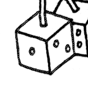
Now turn on the Color layer again.

Select Image > Adjustments > Hue/Saturation.
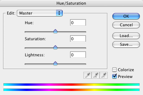
Adjust the sliders until you reach the desired colors.
When finished choose Select > Deselect.
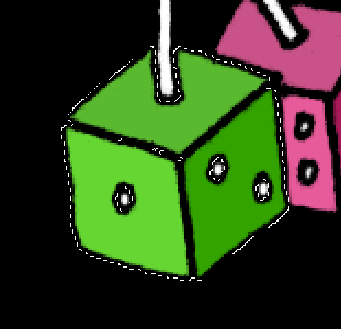
You could also change the color by using your Expand and Fill action instead. But by selecting all three sides and using Hue/Saturation, I could change the color of the entire die at once. If I'd done it the other way, I would have had to select and fill each side separately.
Color choices
So, here's the Solar Plexus artwork, with the flat coloring all done:
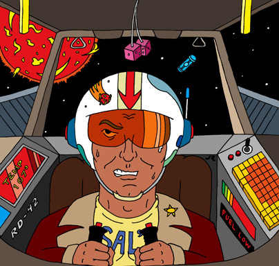
It's not very dynamic, is it? Sort of like an animation cel. Hardly the bathed-in-red-light, hot, glowing environment I described earlier, right? Well, hang on. We'll get there.
But while we're here, I'll go over some of the choices I made.
The ship is mostly gray, because I didn't want it to be a focal point. It's only there so you know the setting that this is taking place in. What's important is the pilot, and that big red sun.
The cooler grays of the inner area of the cockpit help to set off the pilot, who is mostly warm in color. The outer edges and roof of the cockpit are warmer grays, to keep with the warm color theme. The engine vents are cooler gray because they're outside the ship, and I wanted to push them back, visually.
The two yellow things hanging down are escape handles. Or at least they are now. When you're coloring someone else's line art, sometimes you have to guess. They'll make more sense after I add the shading to them. And the dice... well aren't all dice fuzzy and pink?
Originally, I did the keyboard as beige, but it was too boring. So I decided to make it a backlit keyboard, sticking with warm colors. (Bonus points if you can tell me which movie I swiped that from.)
The displays are mostly red because they're warning lights, and I plan to use them as secondary light sources. This will add to that red glow I want. I reversed out the "Fuel Low" lettering, because it reads better. The lone blue control panel is there to match the blue fuel pod floating in space, and add a little color balance to the control panels (as the green lights on the other side do).
The fuel pod floating in space is blue, because I wanted it to stand out. It needed to be a cool color, to contrast with everything else.
The sun is red because, well, it just had to be. I couldn't picture it as any other color. Keep in mind though, red is only the base color. There will be shading and highlights added later to make it appear like it's glowing red-hot.
Jess had specific instructions for the pilot:
the pilot is supposed to look like Craig Charles from Red Dwarf. When you color him (if you choose to tackle this project), make sure he's got a light chocolate skin tone like the actor in the show.
So I did a Google search for pictures of Craig Charles. And there you go.
The color of the goggles is orange, since I wanted to keep with warm colors, and it's reminiscent of the Rebel helmets from Star Wars. The helmet is white to contrast with space and help frame the pilot's face. The blue parts are meant to link the pod and control panel with the pilot, to suggest that there's some sort of communication going on between them.
His shirt, jacket, and the pilot seat are all warm colors. The coat and seat are dark because I want to highlight the pilot's face. It's all about emphasizing what's important to the story that's being told. After all, every picture tells a story, don't it? ![]()
So that's where it's at so far. This has all been colored using the techniques I've described in the tutorials, and once you get going, it all moves along pretty fast. I've made quite a few changes to the colors as I've gone along, but that's just part of the process. Trial and error. Seeing what works, and what doesn't. And I'm sure I'm not done yet. But using Layers and Masks makes changing things easy.
Up until this point, it's been pretty much paint-by-numbers, but without the numbers. Next time we're going to start making the artwork jump off the page.
It's time for... shading!
3 Comments
Recommended Comments